

Key Takeaways
- Choosing the right colors for a presentation goes beyond mere aesthetics. Each color has a specific weight and can influence attention and the perception of the message. Ignoring brand identity or selecting colors disconnected from the company’s image can lead to a presentation that appears out of context and loses effectiveness. Understanding the impact of colors helps create slides that harmonize with the brand, maintaining consistency and enhancing audience connection.
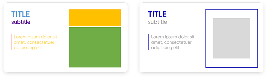
- Using appropriate contrast between text and background is essential to ensure slide readability even from a distance or under varying lighting conditions. Additionally, colors can be leveraged to establish a clear visual hierarchy, highlighting key points and guiding the audience’s gaze through the slide’s elements. Using more intense shades for primary content and softer colors for secondary items helps order information and makes the message easier to understand.
- Relying on structured palettes, such as monochromatic, analogous, or complementary ones, helps maintain a neat and professional visual effect. Random combinations can lead to inconsistent results and a discordant visual impact. Online tools like Adobe Color make it easier to create balanced and functional palettes, offering calculated and targeted color combinations to achieve maximum readability and visual harmony with just a few clicks.
- Adjusting saturation in images is an effective way to direct the audience’s attention to specific details. For example, desaturating a background while keeping main elements vibrant or using the focus effect on images and text creates visual contrasts that guide the gaze precisely. This effect is ideal for highlighting key concepts without overloading the slide with visual elements.
- A coherent and well-planned color palette makes the presentation pleasing and professional, avoiding the “rainbow effect” that can distract the audience. Before finalizing the presentation, performing the “squint test”—observing the slide with slightly closed eyes—helps verify if the main elements stand out and if the visual hierarchy is effective. This simple test ensures that the message is perceived clearly and orderly, regardless of distance or visual conditions.
A practical and mindful approach to selecting functional colors and avoiding common mistakes that compromise the clarity and effectiveness of your presentation
Have you ever wondered why some presentations immediately capture attention, while others seem… well, just flat? The answer might be more colorful than you think!
Let me tell you something: after years spent creating effective presentations, I can confidently say that colors are not just an aesthetic choice. They’re much, much more. They are the difference between a presentation that communicates effectively and one that puts the audience to sleep!
“But they’re just colors!” you might think.
Actually, no. Consider this: you’re giving an important presentation for your brand and you choose colors that you like, but that don’t align with the brand’s identity. The result? Your presentation, no matter how well-crafted, will seem disconnected, almost alien to the rest of the company’s communication.
And that’s not all. Imagine needing to highlight a key message on your slide. If you don’t know how to use colors strategically, you risk placing primary and secondary information on the same level. It’s like shouting and whispering simultaneously: your audience won’t know where to focus!
Sure, sometimes you may have predefined guidelines for your presentations, so you can follow them easily, including color choices, and you’re all set.
But what happens when you need to tap into your creativity? When you have to choose colors for creating your palette (which we’ll discuss more shortly), or if you already have a palette but need to add a few more shades to complete it?
This is exactly what I want to talk to you about in this article.
But before we start, let’s warm up with a quick overview of the most common color mistakes on PowerPoint. Begin by ensuring you’re not making one of these mistakes: once you’re sure, we can start learning to use the endless tones at our disposal like professionals!
Read also: What makes presentations engaging and how you can do it too
Common Mistakes in Choosing and Using Colors on PowerPoint
Let’s talk about those mistakes I see so often that I can spot them from miles away! Fortunately, they’re all easily avoidable once you know how to recognize them.
The first mistake, the mortal sin of presentations: completely ignoring the brand’s identity. I’ve seen people create beautiful slides… that looked like they belonged to another company because the colors had nothing to do with the image the business had built up until that moment! It’s like showing up at a black-tie event in costume. No matter how great your costume is, it’s simply out of place!
Then there’s the famous “insufficient contrast,” or as I like to call it, “the grandma test.” If your grandma has to squint to read the text, you have a contrast problem! And it’s not just about black text on a white background. I’ve seen presentations with light blue text on a pale blue background. Please!
In other words: if you’re combining various elements on a slide, like text on an image, make sure there’s enough contrast between them so that the audience can read everything without straining their eyes!
Another classic: the rainbow syndrome.
You know what I’m talking about, right? Those presentations where it looks like someone spilled a box of colored markers! Remember: you’re not required to use every color in existence on a single slide; in fact, you shouldn’t. Less is more, always!
But the biggest mistake of all? Basing color choices solely on personal preference. “I like it this way” is not a design strategy! It’s like cooking a dish based only on what the chef likes, without considering the diners.
Now that you know these mistakes, you can avoid them! And your next presentation will be not only beautiful but effective. Especially if you keep reading to learn the best tricks for effective color use on PowerPoint!
The Ideal Color Palette Choice for PowerPoint Presentations
Let’s talk about color palettes.
You know that feeling when you open PowerPoint, need to pick colors, and… you freeze? I completely get it! But there’s a solution, and it all lies in understanding what a color palette really is.
Think of the color palette as your ideal soccer team: you need a certain number of players (in this case, colors) that work perfectly together. Not too many, not too few.
The ideal number?
Actually, there isn’t one: each project and situation is unique, but generally, I’d recommend sticking between 2-3 colors and 5-6.
Why this range? Simple: with fewer, your presentation risks feeling monotonous. Too many, and it becomes a visual carnival that distracts and confuses your audience!
But let’s get to the point: how do we choose these colors?
Most people do it “by feel,” experimenting until they find something that seems to work. Click on a color “Mmh, I don’t like this one.” Another one “A bit better, but still not quite right.” Another “Nope, not good either.” And so on, until eventually, they find what they were looking for.
Stop! This is exactly the path you DON’T want to take.
Do you know the difference between a beginner and a professional? A beginner chooses colors based on personal taste, experimenting until something “seems to work.” A professional, on the other hand, knows that colors are calculated. Yes, you read that right: they’re calculated!
Think about how much time you waste choosing colors randomly: click after click, trial after trial, and in the end, you’re not even sure if that combination is truly effective. It’s like shooting arrows blindfolded, hoping to hit the target.
Can it work? Maybe. Is it the best way? Absolutely not!
And there’s more: when you choose colors based only on personal taste, you’re making a fundamental mistake. What you like may not be the most effective solution. A presentation is not a piece of art to hang on the wall – it’s a communication tool that must achieve a specific purpose, namely, clearly and engagingly convey a specific message to the audience.
The good news?
There’s a systematic approach to choosing colors that completely eliminates guesswork. A method that allows you to create color combinations that are not only aesthetically pleasing but, above all, functional for your goal.
It all starts with the color wheel.
Everything You Need to Know About the Color Wheel
Don’t worry – I won’t give you a boring lesson on color theory! Instead, I’ll show you how this tool can become your best friend in creating effective presentations.
Let’s start with the color wheel you see below.

As you can see, the wheel consists of 3 concentric circles, each containing all the colors of the wheel itself. The central one, marked as Hue in the image, is the “tint,” or the pure color.
Of course, this pure color can also be made a bit darker (a shade) or a bit lighter (a tint). By doing so, you get different tones by modifying the so-called value.
To clarify, have you ever adjusted a color in a text editor or presentation software, like PowerPoint or Google Slides, using a brightness slider?
Perhaps with a menu similar to the one below.
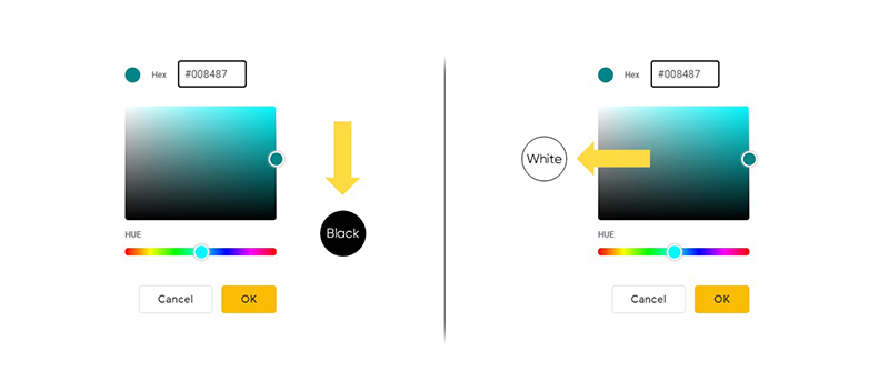
There, you’re essentially changing the value. In the image I’ve provided, you see a slider that allows you to select the tint (Hue). From there, you can adjust the slider, shifting it to lighter or darker tones without changing the tint itself until you achieve the desired effect.
This way, you can create an entire range of tones that add depth and visual harmony to your presentation, all while maintaining color consistency.
“Maurizio, why are you explaining all this?”
Because it will be extremely useful when you need to create the ideal palette for your presentation!
Let’s go through a practical example: imagine you have to work on a slide for a company that’s given you free rein with color choices. The only rule you need to follow is to start with the company’s primary color.
To succeed, you need to take a scientific approach, beginning with identifying the hexadecimal code of the starting color.
“And what on earth is that?”
Have you ever heard someone say, “use the color #FF5733” or something similar? That’s a hexadecimal code, the DNA of colors in the digital world! It’s like a “recipe” that tells the computer exactly which color to display.
Every shade has one, and since we want to use a scientific approach, the ideal is to have the hexadecimal code of your starting color. From there, you can build your palette using 3 possible methodologies:
- Monochromatic palette;
- Analogous color palette;
- Complementary color palette.
Before diving into the explanation, I’ll leave you a reference image below to better understand what you’ll read: you’ll notice a color wheel for each methodology with markers indicating the shades used to compose the palette. The markers with a small notch on the edge, the ones resembling Pac-Man, indicate the starting colors. The others represent the chosen tones to complete the respective palette.

Monochromatic Palette
The monochromatic method is particularly suitable for corporate brands that want to convey an extremely professional and formal image. And it’s incredibly simple to apply: it’s practically impossible to go wrong!
Take the brand’s main color – let’s say the blue you saw in the previous image – and work only with its variations.
How?
By adjusting the value, that factor I mentioned earlier: add more white to create lighter versions or more black for darker ones. Think of a grayscale, but with your color! It’s like having a family of different shades: they’re all close relatives, so they naturally get along!
Here’s an example slide created using a monochromatic palette.

Analogous Color Palette
But perhaps you want something more vibrant?
That’s where the analogous combination comes in.
Imagine the color wheel as a clock: if your main color is at 3 o’clock, take the colors at 2 and 4 as well. They’re like friendly neighbors – they complement each other without clashing! If you start with blue, you could add blue-green and blue-violet. This combination is perfect when you want to create presentations with a bit more personality without going overboard.
Here, too, I’ll leave you an example slide based on this methodology.

Complementary Color Palette
And then there’s the star of combinations: complementary colors, those that are opposite each other. At first glance, finding such matches might seem odd, but they actually work great to create contrast and capture the audience’s attention precisely because of their complementarity.
Trust me; the results can be spectacular!
To apply this method, return to the color wheel: take your main color and then go directly to the opposite side, 180° away. It’s like pairing day and night – they seem opposite, but together, they create a decidedly pleasant effect, as you can see below.

It’s no coincidence that many famous logos use this combination, like Amazon, with its dark blue (almost black) background on which the famous orange arrow stands out – yes, the complement of the background color!
Read also: How to create professional PPT presentations
How to Create a Perfect Color Palette in a Few Clicks
I always like to highlight how important it is in our work to have a practical, fast, and efficient method. The fewer clicks and time we spend on a task, the better, of course, without ever compromising the required accuracy.
So, why complicate things by trying to visualize the color wheel mentally to calculate the ideal palette or sitting down to find the perfect shades when tools exist to do this work for us in a flash?
“Do such tools really exist?”
Yes, and some of them are even free, like Adobe Color, your new best friend! It’s free, available directly online, and does all the heavy lifting for you. Just enter the hexadecimal code of your main color (or choose it with the color picker), and boom! It instantly calculates all possible combinations for you.
Check this out: we start with our blue and apply it to the central box.
Want a monochromatic palette? One click.

Analogous? Another click.

Complementary? It’s got you covered!

It’s like having a personal design consultant available 24/7!
The best part? Once you have your colors, you can import them directly into PowerPoint with a trick few know. And very soon, you’ll be one of them!
Before proceeding, remember just one thing: there’s no universally “perfect” combination. There’s the one that’s perfect for your purpose! If you’re making a serious corporate presentation, the monochromatic might be your best choice. If, instead, you’re presenting something more creative, you could dare with a complementary palette. The important thing is that now you have the tools to make a conscious, not random, choice!
How to Import a Palette from Adobe Color to PowerPoint
Do you know what drove me crazy before discovering this trick? When I wanted to use exactly the company logo color, but I only had an image on the screen. Or when I found a perfect palette online but didn’t know how to bring it into PowerPoint.
Well, this trick solved everything!
But let’s go step by step.
- First, open PowerPoint and Adobe Color side by side, the tool I recommended for creating your palette;
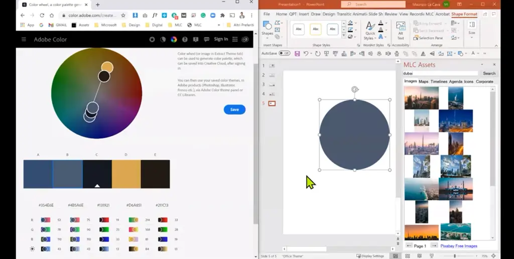
- In PowerPoint, select the element you want to change the color of, such as a shape;
- Click on the button for the change you want to make, like Shape Fill;
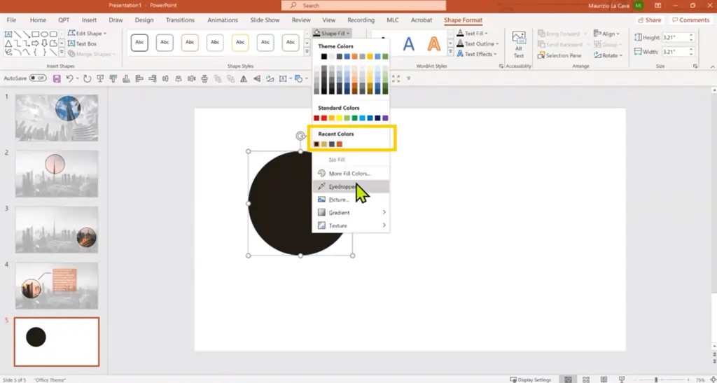
- Press Eyedropper;
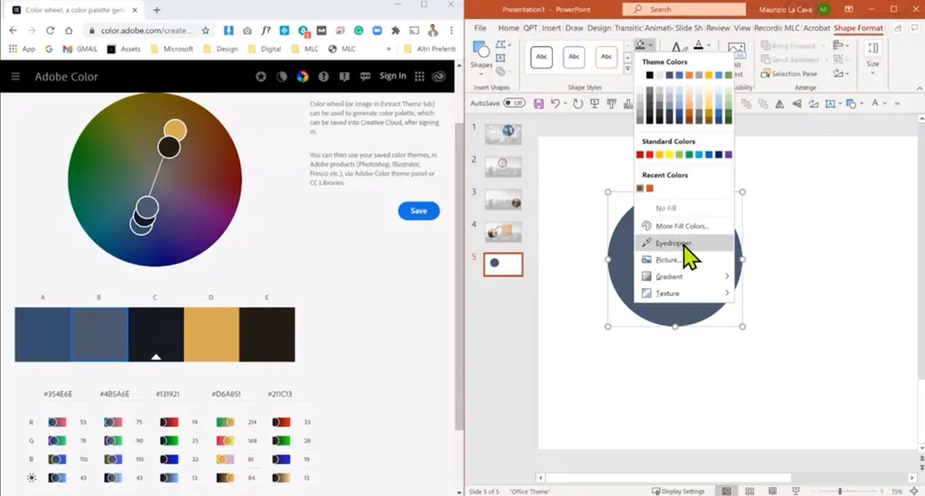
- Here comes the crucial part. CLICK and HOLD the mouse button;
- While holding down, drag the eyedropper cursor outside of PowerPoint. If you don’t keep the mouse button pressed, you won’t complete the operation;
- Move the eyedropper to the color you want to capture;
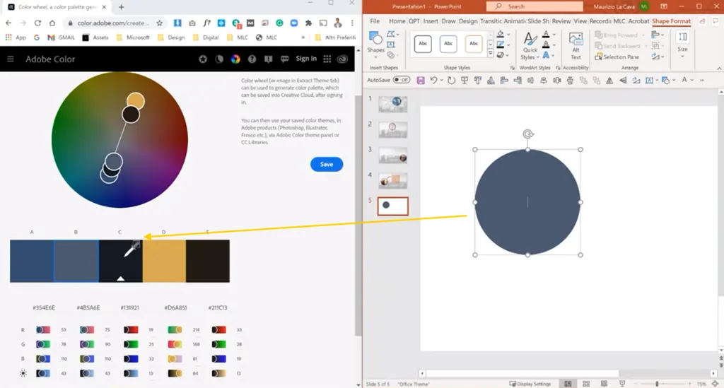
- Only now can you release the button, and the color you chose is now available in PowerPoint;
- Repeat these steps for each shade obtained with Adobe Color, and you’re done. Now you have your perfect palette.
The secret is all in step 4: if you don’t hold down the button while the cursor leaves the PowerPoint window, you lose the eyedropper! It’s like trying to carry water with open hands – you need to keep them closed!
And do you know what the best part is? It works with ANYTHING displayed on your screen.
One last thing: once you “capture” a color, PowerPoint saves it in “Recent Colors.” It’s like having a little color album of what you’ve used recently, always just a click away!
Now you can finally say goodbye to those “what was that logo color code again?” moments or “how do I use that exact shade?” With this trick, the world of colors is literally at your fingertips!
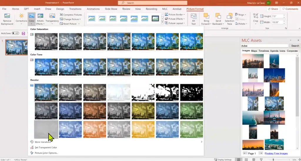
Saturation and Focus Effect
What we’ve discussed so far, of course, applies to those instances where you want to change the shade applied to text or shapes on your slides. But what if you wanted to do something similar with photos? Play around with image colors?
Here’s where saturation comes into play, the true secret weapon of professionals. Saturation is like the “volume” of color: you can increase it for more vivid colors or decrease it to the point of achieving grayscale. Think of black-and-white photos—they’re simply fully desaturated images!
Let me give you a practical example: have you ever seen those presentations where the background is in black and white and only certain elements are in color? It all comes down to a smart use of saturation!
A bit like the example below.

See how the image of the woman stands out against the background? That’s all because the background has minimal saturation, highlighting the subject of the image.
By using these dynamics, we can leverage a powerful effect in our presentations to focus the audience’s attention where we want: the focus effect!
Take a look at the following image.

As you can see, the eye is naturally drawn to the more saturated part, marked by a small circle. All this without needing to resort to outdated and cumbersome methods like the old laser pointer on the screen during in-person presentations (how many times has that happened to you?).
And the best part is that it can be used in countless ways, like this

or this one

and so on.
And the beauty is that creating this effect in PowerPoint is incredibly simple!
Here’s how to do it yourself.
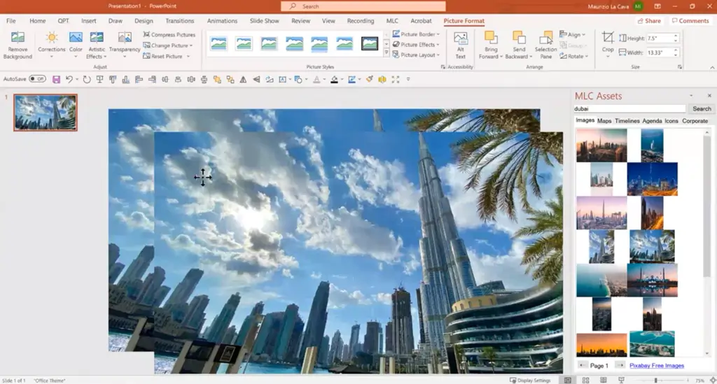
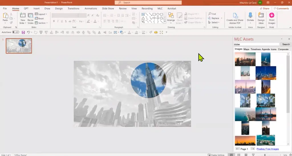
Open your presentation and insert the image where you want to apply the focus effect.
Now, fit the image to the slide using PowerPoint’s relevant function.
Next, duplicate it: just select it and use the shortcut Ctrl + D.
Great, now proceed by selecting the top image and clicking on Crop: in this case, we’re aiming to create a focus effect using a circular shape, so first, select 1:1 ratio.
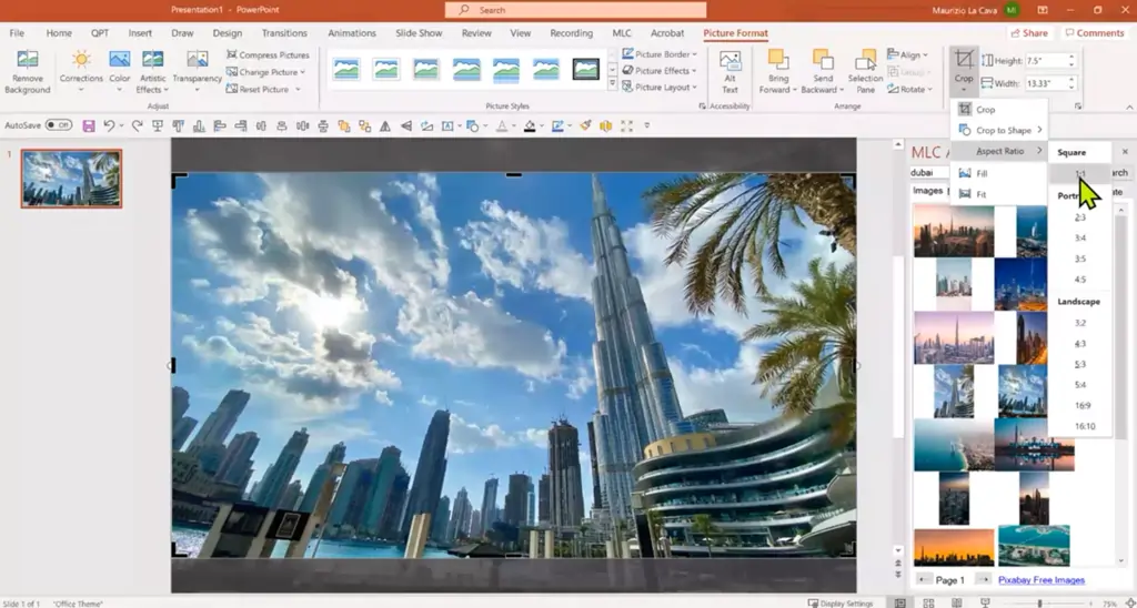
This way, when we give the crop (currently a square) an oval shape, we’ll get a perfect circle.
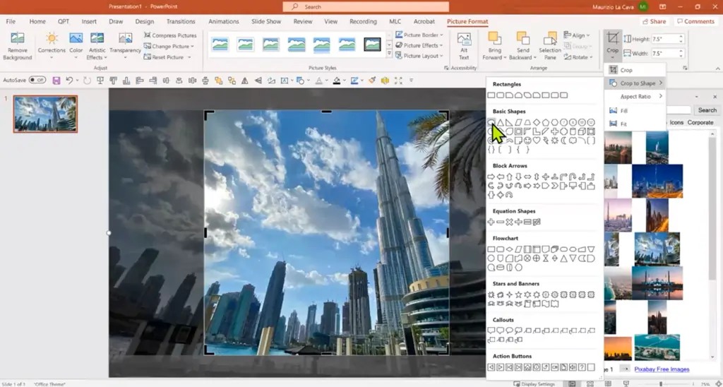
Move the crop to highlight the part of the image you want to emphasize.
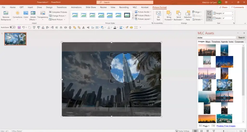
Now we have two images: a complete one on the bottom and an upper one, overlaid on the first, which consists only of the area cropped in the previous step.
Final step: double-click on the bottom image, go to Color, and set the minimum saturation level.
And there we have it—a perfect focus effect!
But we can take it even further!
Imagine wanting to create a movement effect within an image, highlighting different parts in succession.
To achieve this, repeat the same process across multiple successive slides, highlighting different parts of the photo, just like in the sequence below.
One.

Two.

And three!

Fantastic, don’t you think?
Best Practices and Additional Tips
I opened the article with a rundown of the most common mistakes in using colors in PowerPoint presentations, and I’ll close it with a quick overview of additional tips to follow on any occasion, beyond everything I’ve explained so far.
First fundamental rule: when working with corporate colors, don’t try to reinvent the wheel! If your company already has a defined palette, use it as your starting point. But here’s the trick—don’t limit yourself to just those colors. You can create lighter or darker variations of the same colors to add depth to your presentation. It’s like having a basic palette and then mixing in your own shades!
Let’s talk contrast, the best friend of anyone wanting to create effective presentations. The rule is simple: light colors on dark backgrounds, dark colors on light backgrounds. Seems obvious? Yet, I continually see presentations violating this basic rule! Contrast isn’t just about aesthetics—it’s the difference between a presentation that can be read from the back row of the room and one that strains the eyes even in the front row.
And here comes the fun part: visual hierarchy. Think of your slide like a newspaper: you have the main headlines, subheadings, and regular text. Likewise, use colors to create this hierarchy! The most vivid color for main elements, subtler shades for secondary information. It’s like conducting an orchestra: every element has its moment to shine.
But beware of reading levels! You can’t expect your audience to read everything at once. Use colors to guide the eye across the slide in a logical path. Start with the most important element (maybe in a vibrant corporate blue), then move to supporting information in more neutral tones.
A golden tip: before finalizing a presentation, do the “squint test.” Squint your eyes while looking at the slide; the most important elements should still stand out. If you can’t distinguish the hierarchy even with your eyes half-closed, you need to revise your contrasts!
And remember: consistency is key! Once you’ve chosen a color palette, stick to it! No impulsive changes mid-presentation. It’s like wearing a sophisticated suit: every element should coordinate with the others.
These aren’t just tips—they’re the foundation of a presentation that communicates effectively.
Read also: How to Present a Project effectively
Now It’s Your Turn!
We’ve reached the end of this journey into the world of colors in presentations. And what a journey! Together, we’ve discovered that colors aren’t just a matter of taste or aesthetics, but powerful tools that can transform a presentation from “meh” to “wow!”
We’ve seen how to create effective palettes without relying on guesswork, how to use the eyedropper tool to borrow…ahem, take the perfect colors, and how to apply advanced techniques like the focus effect. Not bad for a single article, right?
Remember: the difference between a beginner and a professional isn’t the tools they use, but the approach. While the beginner picks colors randomly, hoping they’ll work, you now have all the conceptual tools to choose them precisely and effectively. No more “I like this,” but deliberate choices based on solid principles!
And you know what’s the best part? These techniques always work! Whether you’re preparing a corporate presentation, a startup pitch, or a lesson for some students, the principles are the same; it’s how you apply them that makes the difference.
I’d love to hear how you use these tools in your next presentations. Did you try the focus effect? Were you able to use the eyedropper trick? Did Adobe Color’s calculated combinations simplify your work?
Share your experience in the comments below!
And if you have any questions, don’t hesitate to ask.
I’ve seen too many potentially brilliant presentations ruined by random color choices. Don’t let it happen to yours! Now you have all the tools to create presentations that look professional and communicate effectively.
Before saying goodbye, I’ll leave you with one last thought: remember that an effective presentation isn’t the most beautiful, but the one that communicates best. Colors serve your message, not the other way around. Use them wisely!
And if you found this article useful, share it with your colleagues and anyone else you’d like! Help me fight the plague of randomly colored presentations, one slide at a time!
Now it’s your turn: take these tips and go create presentations that make an impact. I can’t wait to see what you come up with!
See you soon, and happy presenting!
FAQs
Why is it important to choose the right colors for presentations?
Choosing the right colors for a presentation isn’t just about aesthetics: colors can guide attention, facilitate content comprehension, and help reinforce a brand’s visual identity. Using suitable colors makes the message clear, organized, and enhances the audience’s interaction with the content, improving communication effectiveness.
Is it correct to choose presentation colors based on personal taste?
Basing color choices solely on personal taste is not ideal. It’s preferable to choose colors that align with the brand’s identity and support the intended message. Colors should be chosen strategically to create visual coherence and lend a professional touch to the presentation, rather than relying solely on personal preference.
What is the color wheel?
The color wheel is a fundamental tool in color theory that shows the relationships between various primary, secondary, and tertiary colors. It is useful for selecting harmoniously matched colors and for understanding which shades work best together. The wheel also facilitates the creation of palettes using complementary, analogous, or monochromatic colors.
What methods can I use to create a palette for a presentation starting from a base color?
There are various methods for creating a palette starting from a primary color, including using monochromatic palettes (variations of the same hue), analogous colors (colors close to each other on the color wheel), and complementary colors (opposite colors on the color wheel). Online tools like Adobe Color make it easy to calculate effective combinations from a base color, saving time and ensuring color harmony.
What is the focus effect?
The focus effect is a visual technique achieved by reducing the saturation of surrounding elements and increasing the color vibrancy of a specific area. This creates targeted contrast that directs the audience’s attention to the focal point, making the message more direct and easier to follow. It is very useful for highlighting key parts of a slide or an image.
DON’T HAVE TIME TO READ THE ARTICLE? DON’T WORRY, LET ME SEND YOU A COPY
Comments on Tips and Logic for Choosing the Right Colors for Your Presentations
Subham S
A must read for people like me who work mostly on powerpoint tool.