Tell data stories effectively to communicate business insights
Data is the lifeblood of business, yet turning numbers into compelling stories that drive decisions remains an elusive goal for most companies. While analysts dive deep into the numbers, executives often feel confused and unengaged.
Sound familiar?
The analyst is immersed in making sense of data, convinced that if tortured properly, data will always reveal its secrets (quote Darren Huff, 1954).
The exploratory phase of analysis and discovery of insights is where analysts and managers demonstrate skill and excellence.
The problem lies in the explanatory phase, when the findings need to be communicated.
You know those endless copy-paste of charts and tables from PowerPoint to Excel?
Well, now you know what I’m talking about.
We often spend hours analyzing large amounts of data, only to dump everything into a presentation where we recount the work done and much more than needed.
Do you think I’m exaggerating?
I don’t believe so.
Most corporate presentations the MLC Design Team faces daily are data-rich. After all, business decisions are made based on data.
Presentations rarely lack content, but 100% of projects that come into the studio lack a story.
You might think data storytelling isn’t for you because you’re in finance or sales and present technical data related to economics.
I’m telling you every data set can give rise to a narrative.
Even the title of your first slide can make a difference!
Imagine starting like this: 2023 budget.
Your audience is already preparing for a long, soulless presentation of boring tables.
But if instead of talking about the data, you present the key insight everyone is interested in, you could create curiosity and interest, making the audience eager to know how you plan to execute the budget.

The way you tell the data story makes a difference.
Storytelling isn’t just about spinning a good yarn like Pixar does for kids and adults of all ages. It’s about how you sequence concepts in your presentation. If done right, the data itself could stick in your audience’s memory for a very, very long time.
What do you gain?
You’ll have an audience that eagerly participates in your next presentation, knowing they are getting all and only the key information needed to make the next strategic decision in an informed way.
And that’s where data storytelling comes into play – the art of turning data into impactful narrative.
By combining data, visual elements, and narrative, data storytelling makes information accessible and actionable. Instead of simply reporting facts and figures, data storytellers use context, emotion, and sequence to bring data to life. The result is a memorable story that informs, enlightens, and inspires the audience to act on the data.
You might think this is all very interesting, but since you’re not a creative or storyteller, and don’t have time to package slides, the story can wait.
I understand. I’m an engineer with little creative flair, great attention to numbers, and a strong inclination to optimize available time.
However, I’m sure neither of us wants to bore our audience with a presentation no one will listen to.
The choice is yours. Do we tell data stories or risk adding our presentation to the long list of ineffective ones?
Turning data into stories can be quick and doesn’t necessarily require outstanding creativity. You just need to follow the right method.
Don’t believe me? Follow me and I’ll show you how.
In this article, we’ll explore the building blocks for crafting a data narrative that sticks. You’ll learn how to identify key insights in your data, choose the most suitable visualizations, and shape a compelling storyline using proven narrative structures.
The 3 Core Components of Data Storytelling
Let’s dot the i’s by extracting a formal definition directly from the material of the new MLC Lean Presentation Academy training Presenting Data:
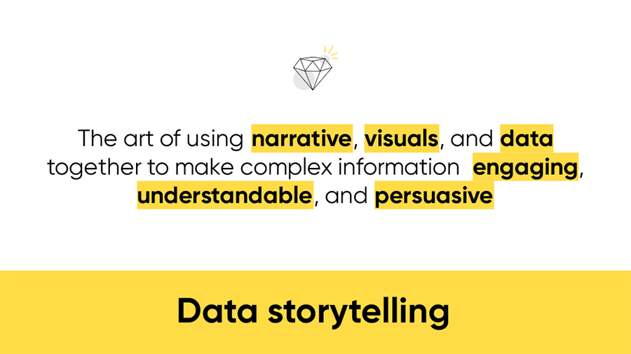
Data storytelling is the art of combining narrative, visual content, and data to communicate effectively.
Does this ring a bell?
This definition makes clear how many components need to converge for data to be communicated effectively.
Let’s look at how it works in detail.
To create a data story you need to consider three core components:
Data – often raw and extracted from a database
Insights – the messages derived from combining data in a way that explains the phenomenon you are exploring
Visualization – how your slides bring the message to life

Before getting lost in data analysis, you need to ask yourself what you want your audience to do after your story.
The data is there for you to build a solid, credible story.
If your story is backed by data, your audience can’t object and will follow your proposal.
Remember when you work on extracting raw data in Excel and look for the best chart to represent it in a way that makes it speak?
That’s right, I wrote making it speak!
In the analysis phase we use data visualization techniques to make sense of the data and see if there is a trend (a line chart), what our market share is compared to competitors (a pie chart), what innovation components will help us execute the strategic plan (a waterfall diagram), and so on.
But in the end, you will arrive at the conclusion you were looking for – an increasing trend that brings good news or a decreasing one that may need attention (if we’re talking sales, for example), a leading market share to defend or a follower’s share to develop, etc.
This conclusion is what we will call an insight and it’s the message you need to communicate in the presentation.
I know very well there will be many interesting insights, but you will need to focus on all and only those that enable the audience to act.
Remember we work following Lean Presentation Design principles, for us “less is more”. I expect you to find the most efficient way to deliver the message and persuade your audience to act.
Finally, the slides, the way you visualize the story makes a difference.
Look at the slide that follows.
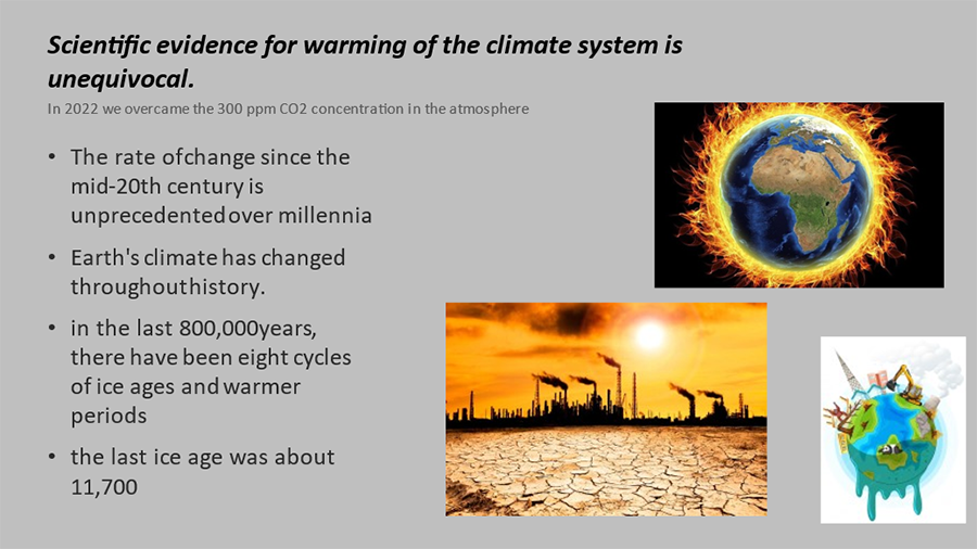
Although all the information is in the slide, you’d have to look at it for several minutes before extracting the key message.
What is the key message?
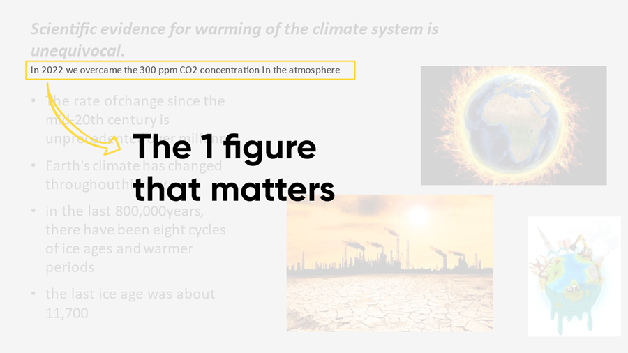
If I had to choose one, I’d say that in 2022 we exceeded 300 ppm of carbon dioxide concentration in the atmosphere for the first time in human history.
Okay, that’s a bit scary.
So it means it works and you’ll have captured attention.
But there’s more.
If that’s the key message, then eliminate everything else.
In the slide that follows, I highlighted the 300ppm by showing a chart that clearly depicts the worrying spike in the trend.
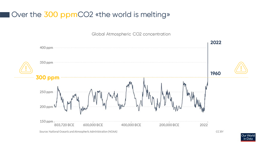
This chart is easier to interpret and leverages some key principles of Gestalt to be processed in a quarter second after the first observation by the human brain.
I’m talking about neuro presentation design techniques applied to creating slides, I discuss them in detail in my book on how to present data.
Now that we’ve set the foundations we can focus on the narrative, it’s time to move on to storytelling.
7 Narrative Archetypes to Craft Data Stories
Telling a business story can be quite challenging.
You need to be practical and concrete.
It’s nice and trendy to talk about storytelling, especially in the world of data, but when you’re facing a P&L and your boss reminds you they want the slides on their desk in an hour, there’s little room for beating around the bush.
You copy the tables, extracted from the company IT system, paste them into PowerPoint as dignified as possible, write titles that are as meaningful as possible, and deliver.
Where’s the story?
Maurizio, there’s no time for a story in my job!
As I was saying, you need to be practical and concrete.
Turning data into a story requires significant creative effort and if you don’t know the steps to follow there will never be time to make it work.
Follow me, I’ll explain how to do it.
All the most successful stories follow a predetermined schema.
Storytelling has always worked and the roots of its success lie in the biology of the human brain.
In my book, Presenting Data, I explain in detail the areas of the brain activated when a story is told to us.
Once you know the structure of a story, you just need to apply it to your data to have the narrative ready.
What structures am I talking about?
Christopher Brooker’s 7 narrative archetypes:
• The Monster – A monstrous/evil creature the protagonist must defeat.
Example: A company that develops antivirus software to protect against cyber threats.
• Rags to Riches – A protagonist of humble origins succeeds and gains wealth.
Example: The story of a CEO who starts as an intern and rises to the top.
• The Quest – The protagonist experiences exciting adventures and trials.
Example: A services firm that helps companies expand into new markets.
• Voyage and Return – The protagonist goes to a distant world and returns changed and matured.
Example: A manager sent abroad who comes back with new skills to apply.
• Comedy – Misunderstandings and mishaps ending happily.
Example: A humorous ad campaign promoting a product.
• Tragedy – The protagonist is ruined by a fatal flaw.
Example: A case of corporate fraud or ethical scandal.
• Rebirth – After a difficulty, the protagonist emerges positively transformed.
Example: A company rebounding successfully after a crisis.
Are you thinking about which archetype your favorite movies fit?
Makes sense, I do that often too.
But how do archetypes apply to a business presentation?
You need to know each archetype follows a standard structure and in my book Presenting Data, I organized all structures into one canvas we call the Archetype Storytelling Canvas.
I’m including it here for your convenience:
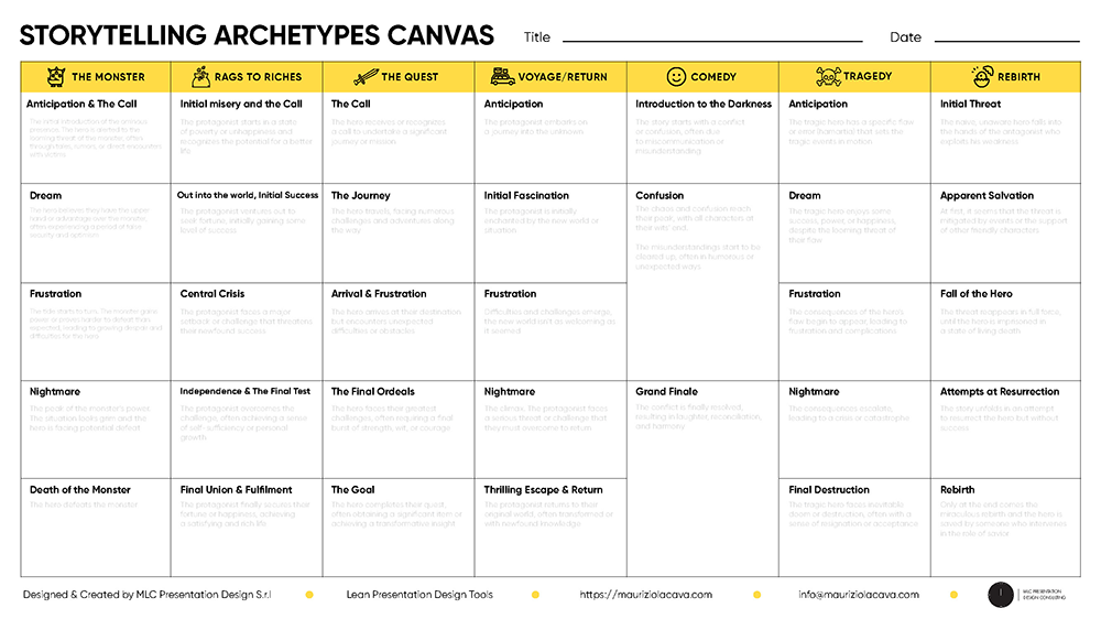
We’ve solved the problem of being concrete. Filling in the boxes will give you stories that grab your audience’s attention.
That’s not enough!
You’re probably thinking this is too much extra work and you need to be creative to use this narrative framework.
Not at all!
Follow me and I’ll show you how to quickly solve the creativity problem.
AI: A Very Creative Ally
You’ve certainly heard that artificial intelligence is not at all creative. Well, you’re about to change your mind!
If you give it the right prompt, it can create stories endlessly!
And if you give it a narrative framework to follow, it will be like putting a train on its tracks and letting it speed to its destination.
Let’s slow down, what would a prompt be?
When talking about prompts in the context of generative AI, it refers to the written instructions given by the operator to the AI.
In practice, these are the tasks you will give the AI.
Being very precise is important.
But this shouldn’t surprise you.
When delegating work to someone who knows nothing about it, writing a good brief is critical.
Consider prompt engineering is now a role.
A prompt engineer’s job is to “translate” your idea or concept into terms the AI tool can understand.
In reality, prompting doesn’t require programming skills.
What made ChatGPT so famous was exactly the accessibility of prompting. In fact, you just need to write in plain language chat to unleash a very powerful AI engine that will work for you.
However, a good prompt is as fundamental as a good brief to get a good result.
Moreover, there are various LLM (large language models) or AI chat tools available, each with its own language quirks.
Enough chatter, let’s name these tools.
AI – Which One to Use?
AI has become part of any creative and productive process of mine, from simple translation tasks to ideating around my data and presentations.
When I’m invited to give a speech, AI helps me prepare content, review the presentation, and if desired, even do some practice to be optimally prepared.
Which LLM do I use?
I use them all, depending on what I need.
My favorite is definitely Anthropic’s Claude2.

It handles a volume of information 3 times greater than GPT4, at least at the time I’m writing this article, but we know this could already be different by the time you’re reading these lines.
To quote the founders: “Users can input up to 100,000 tokens per request, meaning Claude can work on hundreds of pages of technical documentation or even a whole book” (source: https://claude.ai).
Nonetheless, I believe Claude2 is one of the LLM born to stay.
Watch this video and tell me it isn’t amazing:
The beauty of Claude is you can feed it a wide variety of file formats (PDF, txt, csv, excel, etc.) and it will use them to do whatever you want.
In parallel, literally in the window next to it, GPT4 can’t be missing.
You’re probably wondering if I’m talking about ChatGPT.
Indeed, I’m referring to OpenAI’s paid version that currently gives us access to GPT4 (GPT5 was recently announced).
Watch this incredible video: LINK
GPT4 then introduced the code interpreter which has an incredible ability to analyze and synthesize data. It even allows you to create charts that you couldn’t even imagine in Excel, all to find the best way to communicate with your audience.
Claude and GPT4 are two phenomenal tools and, in my opinion, they should be used in parallel. Over time and with practice you will develop the sensitivity to understand whether a request is more suited to one or the other.
The big limitation they share, however, is that neither connects to the internet.
So, if you need to do any research that draws from the web, you have to use Google Bard or Bing AI.
Bard is easily accessible, very efficient and was born to work online.
I often use it to do quick searches. I like unleashing it on the web to aggregate information that would otherwise make me waste time going from one site to another.
I never use it in processing information already available unless it’s photos.
In fact, having integrated Google Lens technology, Bard has the ability to recognize photos.
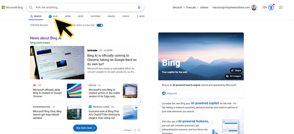
The best alternative for browsing the internet is Bing AI.
It’s easy to use and accessible to everyone, even from Microsoft’s EDGE browser.
What browser do you use?
I now only use Edge, even just for the convenience of having direct access to Bing AI at any time while browsing.
You just have to click on the letter “B” at the top of the browser and start using the chat.
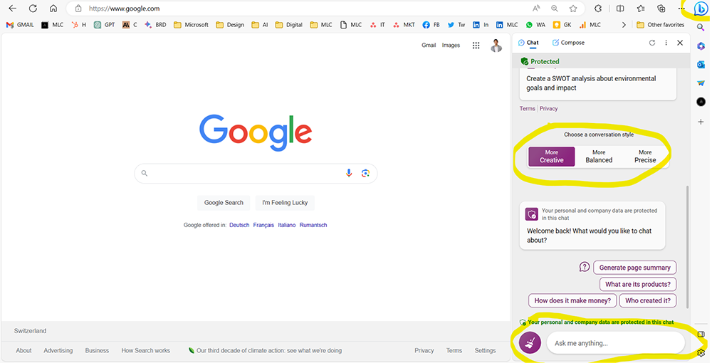
This solution is convenient for “on-the-go” use but if you have to do more in-depth work it’s better to connect directly to Bing AI.
You just need to browse Bing.com and then click on chat.
Bing AI works with 3 modes, all based on the use of GPT:
The three Bing modes differ in the artificial intelligence model used and the approach adopted in providing answers.
In particular, Precise and Balanced adopt more dated AI models, while Creative leverages the advanced GPT-4. As a result, Creative is able to offer more advanced generative and creative capabilities, suitable for imaginative and discursive activities.
On the contrary, Precise focuses on more rigorous and factual answers, while Balanced seeks a balance between content accuracy and creativity of tone.
In summary, only Creative allows access to the full potential of artificial intelligence, with the other two models providing more cautious and limited answers.
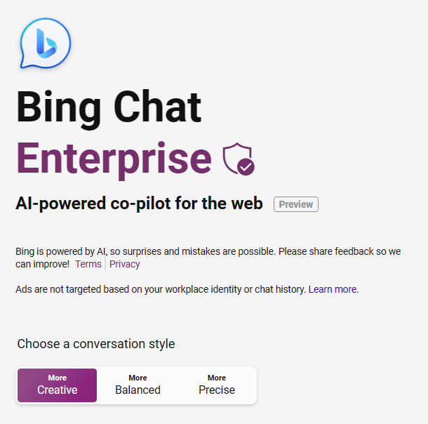
Creative Mode (Purple)
• Works on GPT-4, the most advanced AI model
• Gives more creative and discursive answers
• Can create images
More powerful capabilities
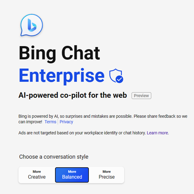
Balanced Mode (Blue)
• This one also does not use GPT-4
• Provides a mix of creative and factual answers
• More balanced
capabilities
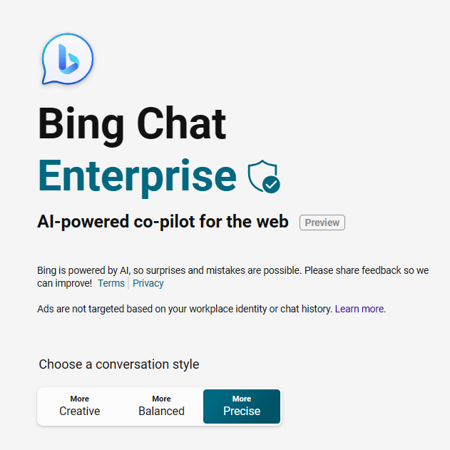
Precise Mode (Green)
• Uses an older AI model, not GPT-4
• Gives more factual and precise answers
• Overall less powerful capabilities
Now you have an overview of the main AI tools you can use to transform your data into an effective narrative.
Artificial intelligence at work: telling a data story
To make a concrete example, let’s take a case study from our Corporate Training – Presenting Data:
Last year our revenue went from 100k to 70k. Customers decreased from 2000 to 1100. We spent more on marketing. The data shows our sales went down even though we marketed more. We should look at the numbers and think about the reasons. We can make a strategy for next year to get better results. The revised data show a decline in sales and customers as marketing spending increases. This creates a conflict between spending more on marketing and seeing worse results.
The narrative is flat and not very exciting, we can do better!
I launch Claude2 and give it the context so it understands what archetypes to use.
PROMPT
Can you create a table where you put one of the archetypes in each row?
Here are the archetypes:
- The monster
- Rags to riches
- The adventure
- Voyage and return
- Comedy
- Tragedy
- Rebirth
For each one, I would also like a description
ANSWER
| Archetype | Description |
| The monster | A threatening external force that the protagonist must defeat |
| Rags to riches | A story of rising up socially, from poverty to wealth |
| The adventure | A journey full of dangers and discoveries |
| Voyage and return | A transformative personal journey, ending with a return home |
| Comedy | A humorous story with a happy ending |
| Tragedy | A sad story ending in catastrophe |
| Rebirth | A story of healing and personal growth |
This step is fundamental because artificial intelligences can easily hallucinate.
What does hallucinate mean?
That they give you plausible but totally wrong information.
For example, Claude2 could have given me completely made-up archetypes with no reference to the real ones.
Working step by step I make sure that Claude2 operates within the parameters of my interest.
Now, we pass the script of our presentation to it and ask it to reinterpret it according to each archetype.
PROMPT
Now I need you to add a third column to the table and to apply each archetype to the following presentation script:
Last year our revenue went from 100k to 70k. Customers decreased from 2000 to 1100. We spent more on marketing. The data shows our sales went down even though we marketed more. We should look at the numbers and think about the reasons. We can make a strategy for next year to get better results. The revised data show a decline in sales and customers as marketing spending increases. This creates a conflict between spending more on marketing and seeing worse results. Please make sure you use a formal but engaging style
ANSWER
| Archetype | Description | Application |
|---|---|---|
| The monster | A threatening external force that the protagonist must defeat | Our declining sales and customer loss is the monster we must band together to defeat. With a united front, we can craft a strategy to overcome this threat. |
| Rags to riches | A story of rising up socially, from poverty to wealth | Last year we fell from revenue grace, tumbling from $100k to $70k. This year we will claw our way back up, drawing on data and insights to ascend once more to profitability. |
| The adventure | A journey full of dangers and discoveries | Analyzing last year’s perplexing data is like an adventure into the unknown. We must embark together, facing dangers but making discoveries that will lead us to success. |
| Voyage and return | A transformative personal journey, ending with a return home | Last year’s revenue decline was a journey that shook us. But armed with lessons learned, we now return refreshed and ready to steer our business back on course. |
| Comedy | A humorous story with a happy ending | Last year our marketing tracked like a sitcom – the more we marketed, the fewer sales we made! But with some data-driven laughs, we’ll get customers smiling again. |
| Tragedy | A sad story ending in catastrophe | Despite our efforts, last year ended in tragic revenue declines. But from this adversity, we will rise stronger and turn the story around. |
| Rebirth | A story of healing and personal growth | Last year dealt us blows, yet from pain comes wisdom. With renewed vision, we will transform our business and restore prosperity. |
The result is exceptional!
For each archetype, Claude2 added an interpretation of my presentation script.
I find it very useful to ask AIs for results in a table. The result is always well-organized and easily usable. Also, I can ask the language model to add a column with the information I want, constraining the AI to work within established boundaries.
Now that we are aligned and Claude2 has the necessary information, we can have it write out all the data stories in detail.
PROMPT
for each archetype I need the script rewritten in detail not just summarized.
ANSWER
Here are detailed rewrites of the presentation script for each archetype:
The monster:
Last year, a monstrous threat emerged that dealt a blow to our business. Our revenue plummeted from $100,000 down to just $70,000. The number of customers we served dropped dramatically as well, decreasing from 2,000 to a mere 1,100. Despite our best efforts to fight this monster by spending more on marketing, it continued to ravage our sales, which declined even as we increased our marketing budget.
The data provides stark evidence of the monster we now face. As we spent more on marketing, our sales and number of customers served both decreased significantly. This monster has created a perplexing conflict – the more we try to fight it with marketing, the more damage it inflicts. But we cannot live under the tyranny of this monster forever. By analyzing the data, thinking critically about the reasons behind it, and banding together with unity and courage, we can craft a monster-slaying strategy for next year.
We will emerge victorious over this threat!
Rags to riches:
Last year our business fell from a peak of $100,000 in revenue into a pit of only $70,000. For a time, we languished in this pit of poverty, our customer count dropping from a high of 2,000 down to a mere 1,100. But, we too shall elevate ourselves again. We will claw our way back out of this hole, drawing on data, insights, innovation and sheer determination to reach new heights of wealth and success.
Our path upward won’t be easy. As the data reveals, even as we invested more in marketing last year, our sales declined. But with enough grit and tenacity, we can leverage those marketing dollars more effectively. We may stumble at times on the road back to the top. But hand-in-hand, step-by-step, we can get there. Our business can and will ascend to new levels of profitability and prosperity. The riches await – we need only seize them!
The adventure:
Last year’s perplexing data presents us with a mystery – almost like a treasure map with clues to unravel. As our marketing spending increased, our revenue, sales and customers served all decreased substantially. But this map can guide us on an adventure if we approach it with curiosity and teamwork. Though the trail may be dangerous with unexpected twists and turns, it will also lead us to discoveries.
Let’s embark on this adventure together, facing the challenges but uncovering insights that will reward us in the end. We must support each other along the way, pooling our different strengths. With creativity and courage, we can traverse this unfamiliar terrain, deciphering the map’s riddles. Around each bend, new wonders may emerge to move us closer to success. This adventure will forge bonds between us and shape us into stronger leaders. And together, we will reach the treasure – a strategy for growth and profitability. Are you ready? The adventure awaits!
Voyage and return:
Last year, our business embarked on a tumultuous voyage, full of storms and choppy waters. Our revenue declined steeply, falling from $100,000 down to just $70,000. The number of customers we served dropped as well, decreasing by nearly half from 2,000 to 1,100. As we sailed turbulent seas, we invested more in marketing, hoping it would help steer us back on course. But instead, our sales continued to decrease even as marketing spending rose.
This challenging voyage tested our limits, but also made us wiser and stronger. Now, armed with the lessons we’ve learned and a renewed sense of purpose, we are ready to chart a new course back home to stability and profitability. The data we collected during the storm will serve as our map. By analyzing it closely, thinking critically, and working as a unified crew, we can navigate adverse conditions more effectively this time. We will keep an eye on the horizon for icebergs ahead. And if storms arise, we will respond calmly, adjusting our sails to stay on course.
With renewed vision and hard-won experience, we will complete this return voyage successfully. Our business will reach the familiar, prosperous shores of our homeland. And we will be transformed for the better because of the journey. Full sails ahead!
Comedy:
Last year, our marketing started off like a lighthearted comedy – we ramped up spending, expecting sales to rise. But the joke was on us when the opposite happened! The more we marketed, the less we sold. Our revenue plunged from $100,000 down to $70,000 as marketing increased. And our customer count dropped from 2,000 to a paltry 1,100.
The data reveals the comical contradiction – more marketing equaling fewer sales. What a twist! It reminds me of a classic sitcom scene where the character’s plans go hilariously awry. But while the numbers seem funny now, we need to get serious about turning this frown upside down.
By analyzing why our strategy failed, we can learn to improve it and delight customers again. We may find ourselves in an amusing mishap or two along the way. But with tenacity and humor, we will get audiences laughing and sales growing once more. And we’ll all live merrily ever after in profitability!
Tragedy:
Last year, our business revenue fell from the noble heights of $100,000 down to the despairing lows of just $70,000. Our customers decreased dramatically as well, from an admired 2,000 down to a paltry 1,100. Despite our virtuous efforts to invest more in marketing, it ended tragically – sales declined even as we marketed more.
This tragic turn of events is evidenced clearly in the data. As our marketing expenditures grew heroically, our sales and customer counts descended pitifully. Why did our honorable strategy fail? What fatal flaw or stroke of misfortune caused this catastrophe? We must reflect profoundly on the reasons behind this tragedy.
But all is not lost – from adversity often blooms hope. Though last year ended in ruin, we can turn the tale around this time. By analyzing the data thoughtfully and banding together courageously, we can craft a new strategy that will lead us to triumph over misfortune. Out of last year’s tragedy, a victorious success story can yet emerge!
Rebirth:
Last year dealt us some difficult blows. Our revenue withered from $100,000 down to $70,000. The number of customers we served also shrank from 2,000 to just 1,100. We tried to nurse our business back to health by increasing marketing spending. But sadly, that remedy did not work – our sales continued declining.
However, the seeds of renewal are already beginning to sprout. The data from last year contains wisdom that can help us grow even stronger than before. By reflecting on what worked and what did not, we can gain rejuvenating insights into how to revive our business. Though the pain we experienced dealt damage, it also presents an opportunity for transformative growth. With thoughtfulness and care, we can germinate a strategy that will allow our business to bloom once more. By coming together and leaning on each other, we will raise ourselves up, flourish, and surpass even our past success. A vibrant future awaits – we need only nurture it with optimism and determination. Like a phoenix emerging renewed from ashes, our business can soar again!
So you’ve also solved the problem of creativity.
You don’t need to be great creatives, you just need to have the right strategic framework (the tracks) to provide the artificial intelligence (the train) through the right prompt (the train commands).
There are already many online courses to become prompting experts but you can already get excellent results by starting to experiment in the first person.
Consider that, except for GPT4, all the other artificial intelligences I told you about in this article are currently available on the market for free.
The next step will be to create the presentation, but we’ll discuss that in detail in the book Presenting Data.
Conclusions
Data storytelling is a fundamental skill for communicating data effectively and engagingly. Through storytelling techniques, it is possible to transform even the most complex data set into a compelling narrative that guides the audience toward the desired actions.
In this article, we explored the key concepts of data storytelling, from identifying insights to choosing visualizations, to applying proven narrative models. We also saw how artificial intelligence can support us in the creative process, quickly generating different narrative interpretations of our data.
By leveraging these techniques, you can create impactful presentations that inform and engage the audience rather than confusing or boring them. Data storytelling is a valuable skill for managers, analysts and professionals in every field who need to communicate data-driven insights. With practice and the right approach, anyone can learn to tell compelling stories from numbers!
FAQ
What is data storytelling?
Data storytelling is the practice of turning data into an impactful narrative that informs, engages and inspires the audience. It combines data, visual elements and narrative techniques to communicate insights effectively.
What are the 4 key elements of data storytelling?
The 4 key elements are:
1. Raw data
2. Insights derived from data analysis
3. Data visualizations that bring insights to life
4. An engaging narrative structure
Can you give an example of data storytelling?
One example could be turning sales data into a story about expanding market share by customizing campaigns to customer segments revealed in the data. Customer data visualizations and archetypal narrative structures engage the audience.
What are key techniques for data storytelling?
Key techniques include:
• Identifying key insights in the data
• Using data visualizations effectively
• Applying narrative frameworks like archetypes
• Creating a logical and emotionally engaging flow
• Focusing only on the most impactful insights
• Making the story easy to remember
What does storytelling with data mean?
It means turning data into an engaging, memorable story through techniques like sequencing, emotions and narratives.
What is the difference between data and storytelling?
Data provides factual evidence, while storytelling engages the audience by organizing and narrating data insights in a compelling way.
How many narrative archetypes are there for creating data stories?
There are 7 main narrative archetypes that can be applied to data storytelling: the monster, rags to riches, the quest, voyage and return, comedy, tragedy and rebirth.
Can I use artificial intelligence for data storytelling?
Yes, AI can support us in the creative process by quickly generating alternative narrative interpretations from our data, following the parameters we indicate.
Do I need to be a programming expert to use AI in data storytelling?
No, the AI tools available today are accessible even without advanced programming skills. Learning the basics of prompting and some simple techniques is enough.
Does data storytelling apply only to technical presentations or other areas too?
These narrative techniques adapt to any industry: sales, marketing, finance, HR, operations, etc. The key is identifying the main insights and creating a story relevant to the audience.
How long does it take to create a data story with these techniques?
By following a structured process with proven frameworks, it is possible to effectively turn data into a story quickly, without necessarily being expert creatives.
Comments on AI Data Storytelling