

Waterfall chart allows you to visually represent changes in a total, making your presentations clearer and more effective
Looking for a way to make your PowerPoint presentations clearer and more impactful, especially when you have to show numerical data that, let’s face it, in figure form don’t have much appeal?
If so, know that the Waterfall chart is the ideal tool for you. With this chart, you can intuitively show the changes in a total value, making it easier for your audience to understand the data, who, at a glance, will be clear about the situation you are describing.
The best part?
On PowerPoint you can create a waterfall chart in a few simple steps, without having to use external software, directly in your slides. In short, turning a bunch of numbers into an effective presentation is easier than you think!
Read also: What is data storytelling and what are its 3 main principles
What is a waterfall graph?
A Waterfall chart is a tool used to visualize how a series of values contribute to the overall change in a total value.
It is commonly used in business and finance to depict trends in progressive data, such as changes in profit or budget over time, and its special feature is that it clearly shows the positive and negative contributions that lead to the final result, making it easier for the audience to feel involved and understand the changes that occurred between a starting point and an ending point.
On PowerPoint, the Waterfall chart can be created in just a few steps and is particularly useful for presentations because of its ability to simplify the presentation of data through a clear visualization, just like the one you can see below in the two examples.
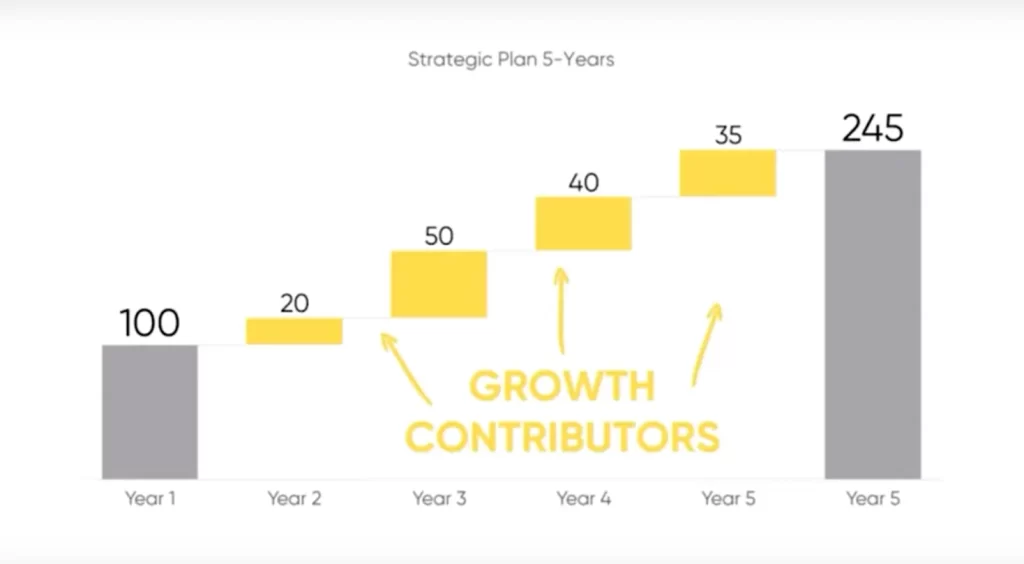

The inner columns in the chart (which I have marked in the image as Growth Contributors) represent the increases or decreases over time: the arrangement of these elements helps you understand how each value affects the change in the total, from the first column to the last.
Please note: columns showing totals can also be interspersed in the graph. Assume, for example, that you want to show the change in a company’s profit over an entire year, but that you want to emphasize the interim milestone of the first six months: in this case, in addition to the initial and final totals, we will insert another one in the middle of the graph showing the total reached after the first six months.
Anyway, in almost all cases the waterfall graph is set up to show only an initial and a final total.
This type of graph is often used to analyze financial statements, showing how individual income and expense items lead to the total profit or loss. However, it can be used in a wide range of contexts, including cost analysis, project management, and process evaluation.
So far so clear, but now let’s go to see specifically how to insert a Waterfall diagram on our slides: trust me, this is a very simple task. You just need to know what steps to follow: and in the remainder of the article I will show you them from first to last.
How to build a waterfall chart in just a few clicks, directly on PowerPoint
Before we start, I have good news for you: we can create a waterfall chart directly in PowerPoint, without having to move to another program.
Convenient, don’t you think?
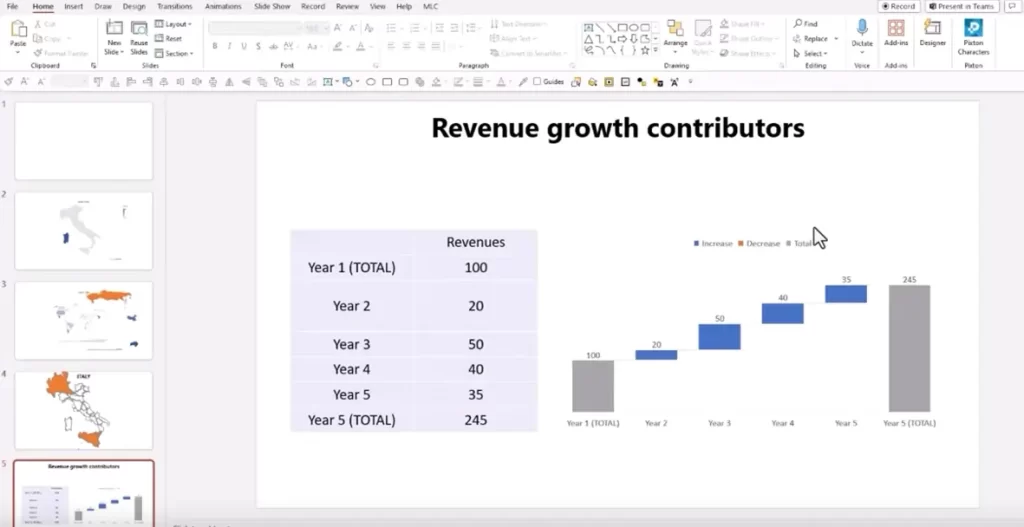
First we should have at hand the data we want to represent through the graph: in my case, as you can see below, I gathered them in an ad hoc table. Do it yourself: you will find it much easier to put them on the graph from such a table.
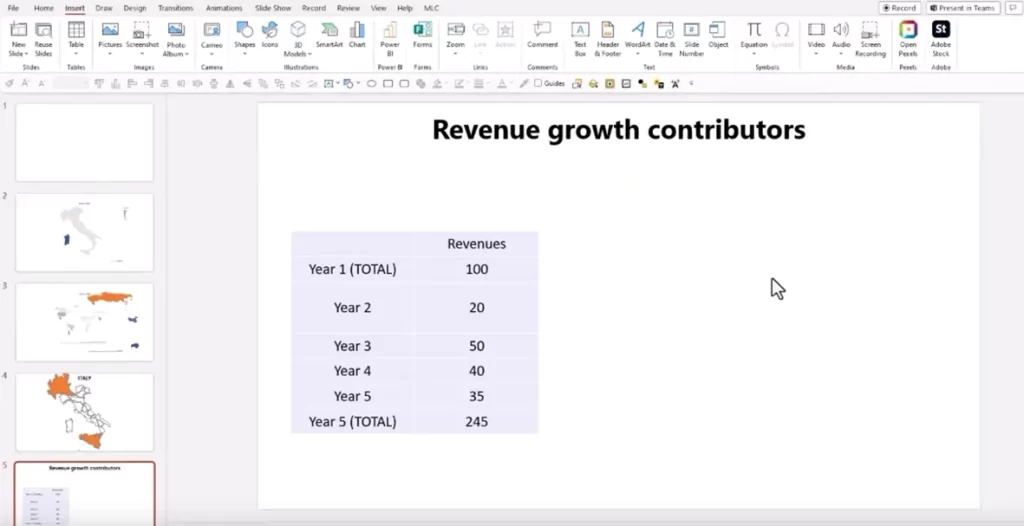
As you can see, this is data that we will need to graphically show the contributions to revenues over the course of 5 years, starting with the total in the first year, up to the total reached at the end of the 5-year period.
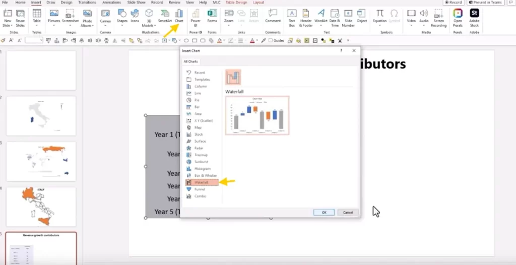
To prepare the chart, click at the top on the Chart button in the Illustrations section and, in the small window that will open, select the Waterfall type, then click Ok.
You will now notice a window in which you can enter the data you intend to display through the chart.
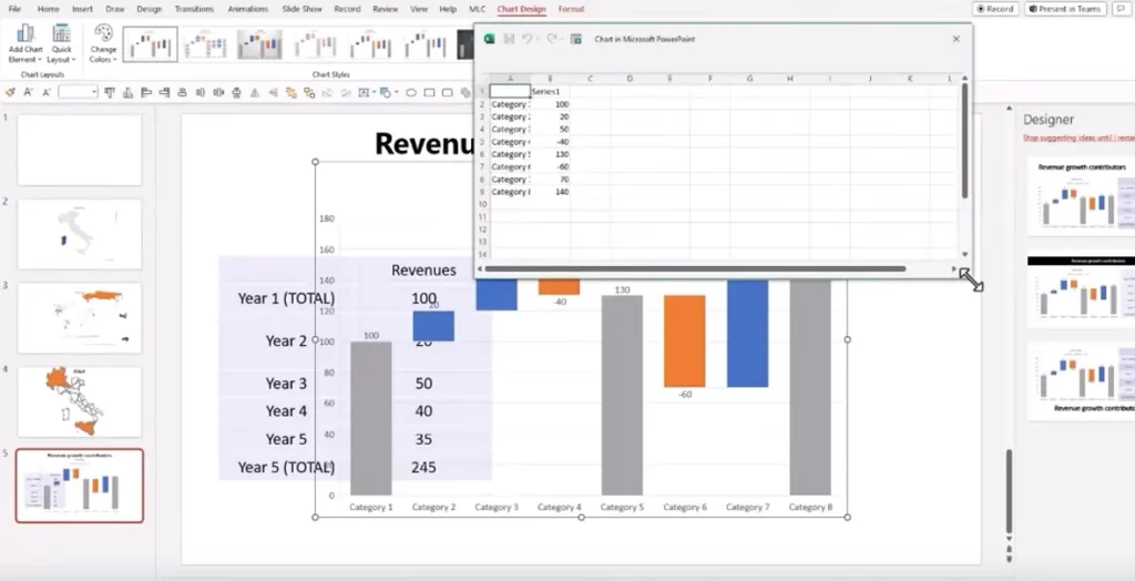
Substitute your own for the default ones with a simple copy and paste, just as I did in the example below.
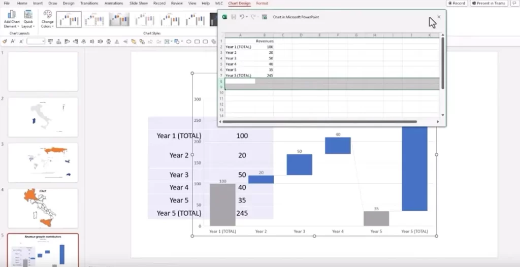
Then, close the little window and here is our graph on the slide, but if you pay attention, it is not ready yet: in fact, in the example below, you will notice that the columns representing the totals are the first and fourth and all the others show the growth contributors instead.
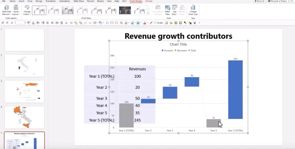
But we need a graph that shows the first and last columns as total!
How do we solve this problem?
Read also: Complete Guide to Creating an Effective Presentation
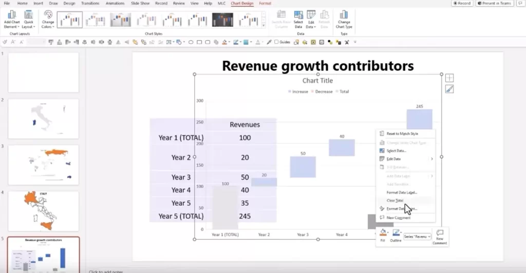
The formatting of the columns of a waterfall graph
It’s very simple: know that we can easily change the formatting of each individual column, deciding for each one whether we want it to represent a total or not.
To do this, right-click on the column you want to change (I started with the second-to-last one) and, if you want to change it from a total to a growth contributor, click Clear Total.
We’re almost there.
Now, let’s turn the last column from a growth contributor to a total: right-click and select Set as Total.
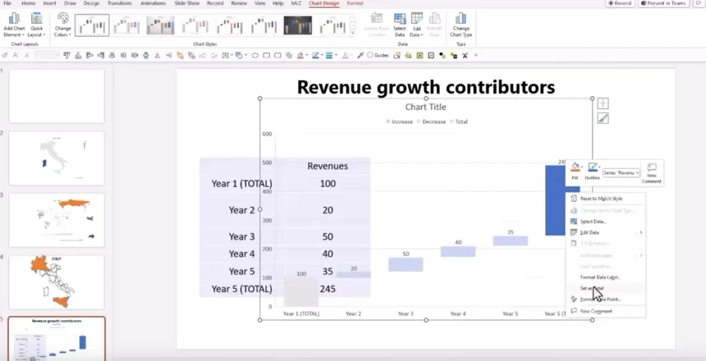
And there you have it: our waterfall graph is pretty much ready. All we have to do is resize it as we prefer (I chose to resize it so that it can be placed side by side with the corresponding table) and we’re there!
Piece of cake, don’t you think?
Put what I showed you into practice and share your experience with me
The Waterfall chart on PowerPoint is a really effective tool for turning complex numbers and data into a simple and immediate visual representation, perfect for creating effective and impactful presentations.
With just a few clicks, without leaving PowerPoint, you can make your presentations more impactful and communicative, making it easier to understand changes in the data.
Now that you know all the steps, all you have to do is put this guide into practice and experiment with creating your first waterfall chart.
What results will you get from your presentations? I’m curious to find out! Try it now and share your experience and impressions in the comments.
Key Takeaways
- The Waterfall graph simplifies the visualization of total changes. This type of graph is useful for clearly showing how variations, positive or negative, affect a total value, making the data more understandable.
- Creating a waterfall graph on PowerPoint is simple and intuitive. Without the need for external software, the Waterfall chart can be generated directly in slides, using the “Chart” button in the “Illustrations” section.
- Flexibility in column formatting is a strength. PowerPoint makes it easy to change the columns, allowing you to define which ones should represent a total or a growth contributor, customizing the display as needed.
- The waterfall chart lends itself to multiple uses. It is not limited to financial analysis-it can be used in a variety of business contexts to monitor costs, evaluate projects or analyze processes, making presentations more impactful.
- The end result is highly customizable. After creation, the chart can be resized and paired with other visual elements, such as tables, for optimal visual impact, improving the effectiveness of presentations.
FAQ
What is a waterfall graphic?
A Waterfall chart, also known as a waterfall graph, is a tool used to visualize how a series of values contribute to the overall change in a total. It is particularly useful for clearly depicting positive and negative contributions leading from the initial total to the final result.
What data can be shown effectively through a waterfall graph?
A waterfall graph is ideal for showing changes in profit, financial balances, income and expenses, or any set of values that contribute to the change in a total. It is often used to represent financial data, but can also be used in other contexts such as cost analysis or project management.
What software can I use to create a waterfall chart to include in my presentations?
You can easily create a waterfall chart on PowerPoint. Just go to the “Illustrations” section, click on “Chart,” select the “Waterfall” type, and enter your data, conveniently from your slide, without using additional programs.
DON’T HAVE TIME TO READ THE ARTICLE? DON’T WORRY, LET ME SEND YOU A COPY
Comments on How to create a waterfall chart on PowerPoint