DON’T HAVE TIME TO READ THE ARTICLE? DON’T WORRY, LET ME SEND YOU A COPY
Creating professional PPT presentations is essential to communicate your ideas in an effective way and thus succeed in business.
Maurizio, isn’t good content enough?
Good content is certainly the starting point, but if not presented effectively, even the most brilliant idea is likely to go unnoticed.
Let me give you an example.
Think about the last time you received an invitation for a job interview – how did you dress?
I’m sure you didn’t choose torn or dirty clothes, regardless of what your level of preparation was.
The way you present your ideas makes all the difference, and this applies to all kinds of projects, from getting a budget approved to trying to acquire a new client, or even getting your new startup funded.
What makes PPT presentations truly professional?
I want to share with you 8 tips based on my experience that will help you make your PowerPoint presentations look more than professional.
Shall we begin?
Professional PPT Presentations – Tip #1: Think Before You Design

When it comes to creating presentations, we are often led to believe that it is merely a graphic exercise.
Do you know how many times I get calls from clients asking me to embellish their presentation? I always ask if the presentation already has all its content and if it has it well organised into a strategically effective storyline for its intended audience; but often the answer is affirmative, and I’m just told that it lacks a bit of decoration.
There you have it – there’s nothing worse than underestimating the importance of the communication part in a presentation.
If you want to learn how to create professional PPT presentations, you can’t just think of starting with PowerPoint.
Take a step back and get yourself a pen and a piece of paper – or a pencil, which is probably better.
At this point, ask yourself:
- Audience: who are you addressing?
- Objective: what do you want people to do that they wouldn’t have done at the end of your presentation?
- Resistance: why would they not do it?
These three questions are the foundation for creating an effective storyline.
Get to your goal and be clear about what you expect from your audience.
If you need to present them with your ideas in order for them to act, it means you need to instill a new level of awareness in them:
- What are they thinking today?
- What do you want them to think after the presentation?
This evolution in the way your audience thinks is the right way to define the goal of your professional PTT presentations.
Once you’ve clarified these three aspects, you can finally get into the storyline, which is the order in which you will present your information.
This initial part is the starting point of the Lean Presentation Design process. To address it in a structured way, I created a tool called the Lean Presentation Strategy Canvas (shown below).

The Lean Presentation Design Strategy Canvas is a step-by-step guide that allows you to lay the strategic-communicative foundation for your presentation.
I applied this model to explain how to create an effective business presentation (click to read the guide where I explain how to do it).
Professional PPT Presentations – TIP #2: Use quality images

Visually communicating a concept to your audience is much more effective than conveying it to them in writing.
Have you ever heard of the Picture Superiority Effect?
It refers to the phenomenon where images and photos are more likely to be remembered than words. This principle has been studied far and wide and demonstrated in numerous experiments.
Essentially, it is based on the assumption that human memory is sensitive to symbolic/visual stimuli.
If you are curious about the scientific literature you can have a look at the development of the Picture Superiority Effect.
How does this actually translate to our PowerPoint work on a day-to-day basis?
Simple – try to communicate visually wherever possible and, of course, use quality visual content.
What do you mean by quality visual content, Maurizio?
Look, I’ll be happy if you avoid using grainy, copyrighted images illegally downloaded from Google.
Where should I get them, then?
For example, you could use the library I made available to you through the MLC PowerPoint Add-in:

Thanks to partnerships I develop with the best online photo stock portals, I can provide you with a collection of millions of high-quality, copyright-free stock images just a click away.
Watch, I’ll show you how simple it is.
Search for the word ”meeting”, for example, and click on the first result.

Now, you can use the Fit To Slide feature in PowerPoint to extend the photo to the whole slide in just one click.

Now you can already start building by introducing typographic content, but with a respectable background. We could, for example, apply the transparency box technique to get a contrast area and prepare the ground for introducing textual content.

If you want to learn how to use transparency boxes I’ll let you read my guide on how to effectively combine text with images in PowerPoint.
You can download and try MLC PowerPoint Add-in for free or alternatively, you can use my image search portal available for free on my website.

In short, try to communicate in a visual form and use quality images.
Professional PPT Presentations – Tip #3: Use Icons and Vector Graphics

Sometimes you can’t use a full-slide image because you have to follow a strict corporate template, or maybe you have a lot of messages to convey in the same slide and you need more visuals.
Maurizio, can’t I just use a lot of smaller images?
I really wouldn’t advise that.
Images work well when they are enhanced, so when they are few and very large. I use a large one on every slide and, only in rare cases, I use a few more.
So, what can you do?
The most popular alternative is definitely vector graphics.
Graphics what?
I’m talking about icons that are widely used in professional and business PPT presentations.
Icons are harder to find than images because everything you find on Google is absolutely garbage.
If you want to get into the nuts and bolts of using icons in PowerPoint I recommend reading: Icons for PowerPoint – The Ultimate Guide
For the purposes of this article, I’m just going to show you a couple of places to get these icons.
First, remember that we are looking for SVG vector format icons. We’re not interested in other formats like PNG or JPG because then you can’t edit their color or texture in PowerPoint.
What do you mean by edit?
Here, let me show you.
On MLC PowerPoint Add-in I have provided you with a library of hundreds of icons designed by my team and ready to use free of copyright.
In the side panel, under the Icons tab, you’ll find my personal collection of icons, specifically designed for business presentations.

Being vectors, you can just click on the color button to change the color. I have used the brand colors feature to show you a new way to always have your brand colors at hand, which you will be using recurrently in your presentations.

To get a good grasp on how to use the brand color feature, feel free to click here.
Have you noticed that since it’s a SVG format you can change the color on the fly and apply the one you prefer?
Well, now I’ll show you another interesting technique.
Imagine that the available icons are not enough for you, now I’ll show you a technique to expand your starting collection to infinite combinations.
Insert an icon, obviously in SVG, and now separate it twice as if it were a group of objects.

At this point, PowerPoint will convert the icon into a set of easily editable objects:

Can you see the potential of this technique?
You could, for example, replace the gear with a light bulb and create an icon that symbolizes a new meaning.

In this way, the collection of icons I have made available to you becomes much richer than what it might seem at first glance.
I leave it to you to find the best combinations.
You can download and try MLC PowerPoint Add-in for free to give it a try.
Alternatively, you can use the portal https://www.flaticon.com/

Or https://thenounproject.com/

On both portals you will find a number of icons available for free.
Always remember to download the SVG version.
HINT FOR YOU:
If the SVG version doesn’t work, it means that your PowerPoint is not sufficiently up to date yet. I use the latest available version of the Office 365 package. Make sure you have the latest version available as well. Alternatively, you can always use the PNG format which, being an image format, does not allow you to change the color on PowerPoint but still allows you to use the icons even on older versions of PowerPoint.
Professional PPT Presentations – Tip #4: Avoid Animations and Focus on Smooth and Immediate Slides

Now let me ask you a question.
Have you ever seen me deliver a live presentation?
If not, I invite you to follow me on my YouTube channel and watch some of the presentations where I use slides.

Have you noticed how I flow through the slides?
They slide quickly and follow me as I speak, but I never stop to comment on a slide for too long.
I believe that a good presentation is a game of catch between the speaker and his slides.
What do you mean by that, Maurizio?
I mean that the audience should stay focused on you and then, when you click to show the next slide, they should turn their attention to that.
They should grasp the message you are communicating within seconds and return their eyes to you. This way, the slides will always be a visual confirmation of the concepts you are explaining and will never steal your attention.
Therefore, everything that pertains to the world of animations and transitions is a mere graphic gimmick for me.
What’s the point of adding a skit or a 3D transition effect between slides?
None!
We only do it because we think our presentation will be more appealing, but it’s not true. Every animation or transition you add are extra clicks and are a waste of time if, as I contend, they don’t add any value to the usability of the content for your audience.
So, leave motion effects alone and focus on making your slides immediate and usable at a glance – you’ll already be halfway to making professional PPT presentations.
A HINT FOR YOU:
Remember that the moment you decide to move to the next slide is really important. You have to learn how to coordinate your speech with the exact moment you are asking the audience to shift their attention to one of your slides. If you’re interested in learning more about this topic, leave me a comment and maybe we can organize a live broadcast.
Professional PPT Presentations – Tip #5: Choose the Most Effective Color Scheme

If you have a corporate PowerPoint template to refer to, then you don’t have much of a choice – just follow the color palette you need to comply with.
In this case, you’ll have to be careful to work consistently with the official palette.
Do you know how many times it happens to step out of the standard palette and introduce colors that are similar to the official ones?
That’s why in the MLC PowerPoint Add-in I introduced the Graphics Consistency panel for PowerPoint. This way, we can always keep an eye on the colors and fonts used within the presentation without having to check them slide by slide.
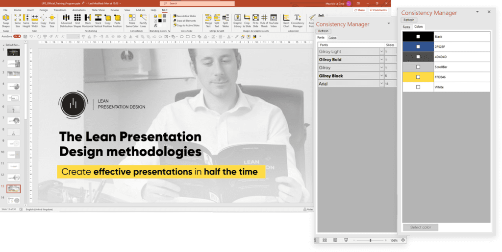
As you can see, in the side panel you get a list of all the fonts and all the colors, with their respective codes, used within the presentation.
You can also quickly edit both from the panel.


What if you don’t have an already defined corporate PowerPoint template?
Then you need to learn how to create your own color scheme.
In Lean Presentation Design, we don’t choose colors according to taste, but calculate them in order to achieve the most effective color scheme in the shortest possible time.
Calculate colors?
You got that right!
Follow me on the website https://color.adobe.com

Sounds complicated?
Don’t worry, I’ll walk you through it.
All professional PPT presentations are based on a color palette made up of 5 different shades. The central color is the dominant one, and from that we can derive all the others so that they combine effectively with each other.
I’m not following you Maurizio, help me.
Look, it’s very easy.
Picture yourself working with Amazon’s branding and using the dark blue color of the header as the main color from which to calculate the color palette.
To know the hexadecimal code of the header you have to use the eyedropper on PowerPoint.


Now paste the hexadecimal code directly into the central slot in Adobe Color.

You’ll notice that the entire palette has changed according to the central color you entered.
Now all you have to do is try out the different combinations to see which one suits you best.
My favorite, for example, is the complementary combination, because it allows me to always have an opposite color to work with.

That complementary mustard is a bit dull, actually.
Let’s increase the color value to make it brighter.

There you have it, a ready-to-use color palette for producing professional PPT presentations.
Professional PPT Presentations – Tip #6: Choose the Right Font

As with colors, font type is also a very important choice that is often tied to corporate PowerPoint templates.
As usual, do you have a template to follow?
Follow it regarding the font as well, and work within the brand guidelines.
If, on the other hand, you have the possibility to choose the font you prefer, then it’s worth making some considerations to direct you towards the best choice.
Best for whom?
For your audience, it’s obvious!
Designing professional PPT presentations means being able to craft the best medium for your audience.
What kind of experience do you want your audience to live?
Are you going to deliver your presentation live, or are you going to send the document for your recipients to enjoy on their own?
Typography is a complex subject and choosing the right font may seem more complex than it really is.
Open the font panel and you’ll find a cascade of them.

Which one should you choose, other than the usual Calibri or the traditional Arial?
I’m about to let you in on a secret that will allow you to see fonts with very different eyes.
Ready?
Here we go!
There are two main families of fonts: those with graces and those without graces or, in French, serif and sans-serif.

Did you notice the difference?
It’s the little tails (or serif) that end the letters.
Times has little tails while Calibri does not.
What do you think these tails are for?
Serifs are designed to guide the reader’s eye from one letter to the next in order to make reading easier.
That’s why you’ll find extensive use of fonts with serifs in long texts where the designer wants you to read line by line. The classic example is novels and long newspaper articles.
What about sans-serifs?
Sans-serif fonts favor skim reading, which is the typical fast reading style of the Internet. Think about when you search for something on Google, you don’t read all the text that is proposed to you, you jump from one part to another by keywords until you get the result.
Which font should you choose?
At this point, it depends on the type of experience you’re designing for your audience.
Professional PPT Presentations – Tip #7: Use Presentation Hacks to Present Virtually

Nowadays, presentations have become, for the most part, virtual.
Some say it’s worse because you lose human contact with people.
I understand and agree with the point, but I see the glass half full, and I’ll tell you that virtual presentations hide important opportunities.
Clearly, you need to go beyond simple screen sharing and use a few little tricks that can really wow your audience.
What tricks are you talking about, Maurizio?
First of all, on Microsoft Teams you can stand right in front of your slide, getting out of the little square that doesn’t really highlight you as a speaker and giving the impression of being much more present and closer to your audience.
How?
I made this short video to explain it to you step by step:

Another life-saving technique is to use PowerPoint’s speaker mode by splitting your screen in half so that you have control of the presentation direction and the virtual conference room.
In this video I’ll explain you how to do this:

Professional PPT Presentations – Tip #8: Try, Record Yourself, Learn and Try Again

Last but not least, you need to prepare, and you need to do it really well!
How many times do you repeat your presentation before the actual presentation day?
I’ll tell you right now that I’m not one to count the number of repetitions, but I do value the presentation phase.
We all know that rehearsing is good for you, but we are also aware that boring colleagues and friends that are listening to us is not always pleasant.
My advice is to record yourself!
Yes, you got it right.
Start a call and record yourself so you can see yourself perform.
I can guarantee you that you have so much to learn from yourself.
Give it a try and if you’d like, share a clip of your video with me via LinkedIn, I’ll be happy to give you some feedback.
Conclusions
Creating professional PPT presentations is essential in order for your ideas to be successful. A presentation, however, is not just made up of slides.
That’s why you have to think first of the strategic-communicative part and then about the storytelling of your content.
Then, of course, graphics have their role and that’s why in this article I suggested you use high quality images and icons.
Stylistic choices are still very important, and that’s why you must know how to choose the best combination of fonts and colors.
Now that you have all the keys to create professional PPT presentations in your hands, I look forward to seeing some of your slides! Post them as PDFs and tag me on LinkedIn, I’ll give you my feedback.
Comments on How to create professional PPT presentations