DON’T HAVE TIME TO READ THE ARTICLE? DON’T WORRY, LET ME SEND YOU A COPY
All companies with structured marketing use a corporate PowerPoint template for internal and external presentations.
This allows you to work efficiently and communicate consistently with the brand guidelines.
More efficient in the sense of faster?
Yes, I mean that with a corporate PowerPoint template you will increase your productivity.
With a well done corporate template you won’t have to waste time imagining new layouts because you’ll find them ready to use, and if you are able to use the PowerPoint slide master, you can even use existing layouts to create new ones.
In the guide – Why does the Corporate PowerPoint Template fail and how to make it work – I told you how to start from a 6-chapter agenda layout and create a coherent one from just 5 chapters.

Usually, when you need a PowerPoint Corporate Template, you contact your graphics agency and commission it.
I fully agree, everyone has to do their job and you don’t have time to waste to suddenly improvise as a PowerPoint Presentation Designer.
On the other hand, you may need to quickly edit a PowerPoint template, or you may need to create a simple PowerPoint template in a short time for an upcoming event.
You could, for example, create a couple of essential layouts, laying the groundwork for a template that is consistent with the brand guidelines, and then, once the urgency is over, send it to the agency to use it as a base from which to create a complete template.
Are you able to create a simple PowerPoint template?
If you have any doubts or don’t know where to start, don’t worry, you’re not alone.
This is technical work that requires knowledge of the brand guidelines and, at the same time, advanced PowerPoint technical knowledge and remarkable graphics skills.
Are you about to throw in the towel?
Wait, let me explain and you’ll see that you can get great results.
To create a PowerPoint template, the first thing to do is to access the master slide and define which elements to insert in the theme and which ones in the layout.
What am I talking about?
I’ll explain right now.
What is the slide master in PowerPoint, and how does it work?
The slide master is the basic architecture of a PowerPoint presentation.
Think of it as the skeleton of any effective presentation.
The curious thing is that, since it is not directly visible, you are often not aware that you are using it.
I can already tell you that even though you don’t know what I’m talking about, you’ve been using it for years.
Surprised?
In that case I strongly suggest you read the next lines, because there is a big difference between using an instrument in a conscious way and using it in an unconscious way.
Enter the views menu and click on the slide master button:

What do you see?
First of all, note that in this screenshot the slides are hierarchical – there is a main slide and all the others below.
The main slide is the theme of the presentation while the others are the layouts.
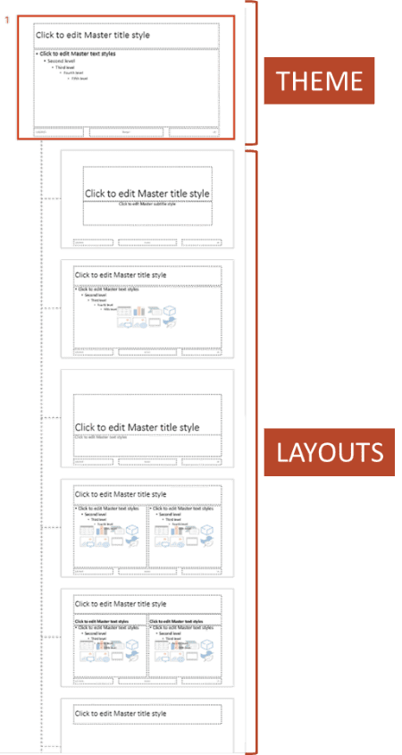
The theme controls some graphical aspects of the layouts which, in turn, inherit these properties directly from the theme.
So, if you place a logo in the theme, you’ll see that it will be automatically replicated in the same position on all layouts.
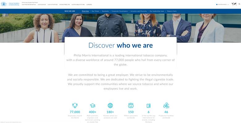
Take for example the Philip Morris International logo and place it on the theme – you can see that it will be placed on all layouts.
Why Philip Morris?
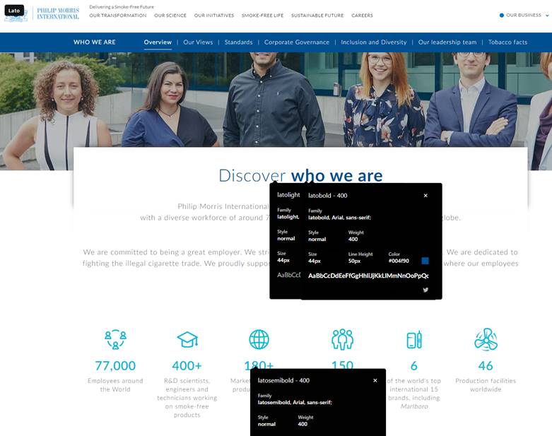
Actually, I’m not a smoker, but I really appreciate their branding both in the choice of colors and typography and in the application.
In fact, I really like the combination of blue and light blue, and I find the choice of fonts elegant.
I think it’s a very Lean work that shines through on their website.
Let’s compliment them and take them as an example for this guide.
But what is the connection between the layouts and slides you are used to working with on a daily basis?
It’s simple, and that’s where the magic lies!
A layout can control one or more slides and make them all consistent.
Think about that for a second.
A theme is a set of layouts that are applied to the slides you insert the content into.
You can imagine layouts as cages for your content.
The theme controls the layouts and the layouts control the slides. Therefore, a change applied to the theme will be inherited automatically from all layouts and, consequently, from all slides.
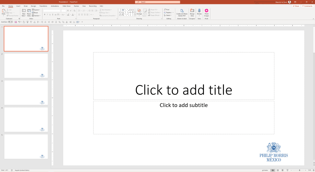
In fact, if you close the master slide and go back to the presentation, you will notice the logo placed in all slides.
To return to presentation mode go to Slide Master and click Close Master View.

Can you see that the logo is on all the slides?
Have you figured out where the magic of PowerPoint slide master lies?
Think about that for a second.
You pasted the logo once in the theme slide, and the master automatically and consistently replicated it on all the layouts and then on all the slides.
If you now want to move or shrink it, you only need to make one change to the theme instead of editing it slide by slide.
That saves you a lot of time, doesn’t it?
If you are curious about how the slide master works, you should definitely read the Guide to Slide Master.
To be able to create a PowerPoint corporate template, it is essential that you know how to work with the slide master.
Let’s go on.
Which sections make up a PowerPoint corporate template?
My team constantly creates and updates corporate templates of large multinational groups and, from experience, I can tell you that each template is a project in itself.
How?
I mean that each company works in a different way, communicates in a different way and produces different content.
Therefore, it is necessary to do a lot of customization work in order to create a corporate template that is really understood and brings in the company efficiency in the way of working and communicative effectiveness.
For me, the corporate template is like a tailored suit, and it should be treated as such.
But we can identify some recurring sections that will certainly be part of a good PowerPoint corporate template.
I’ll list the main ones:
Cover
The opening slide of the presentation. It usually contains the title, date, the name of the speaker and the logo.
There may also be several alternatives in a template that vary depending on the business unit.
You may want to change the background image or maybe the color palette.
In any case, this is the opening slide of the presentation.
Agenda
The table of contents, chapter by chapter.
It may also contain sub-chapters and, in more structured presentations, even a short description of each section.
Section divider
It divides one section from the other to make it clear to the user that you are changing the topic.
It could have a graphic that recalls the agenda and highlights the reference section, or it could look like an inside cover.
Content slides
All the layouts that users need to insert the contents of the presentation. This is the section with the most layouts available.
Back cover
The closing cover of the presentation. It is often characterized by a thank you and the contacts of the speaker or the company.
Tools (icons, maps, images, flags)
Not very prominent but, in my opinion, very useful in a good PowerPoint corporate template.
It’s a series of ready-to-use tools already inside the presentation like icons, vector maps, flags, and more.

This is a very common practice in the consulting world, where business topics almost always include all these tools in addition to schemes and patterns typical of that industry.
In order to help people without this section in their PowerPoint corporate template I developed an additional feature for PowerPoint that I called Graphic Library (MLC Assets).
Graphic Library (MLC Assets) is a library of all the assets that can be useful for anyone preparing a PowerPoint presentation.
At the moment you can find millions of high-resolution, free and copyright-free images and also vector maps of all the countries in the world divided by regions and separately colorable.

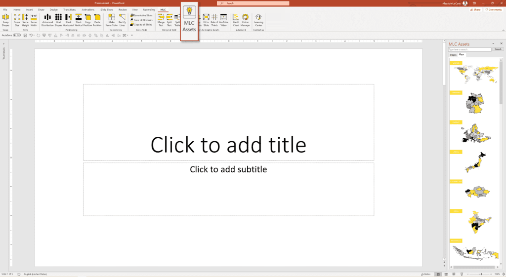
You can try the MLC PowerPoint Add-in for free, if you wish.
Let’s create a cover for the PowerPoint corporate template together
It’s time to get our hands dirty, let’s do it together!
Let’s create a sample cover for a hypothetical template for Philip Morris International (hereinafter PMI).
First, let’s set the presentation font.
What font does PMI use?
On the website, they have chosen to use the “LATO” family of fonts in its bold, light and semibold versions.
Honestly, I like it very much, so let’s use it in the presentation.
In the slide master menu open the font window:
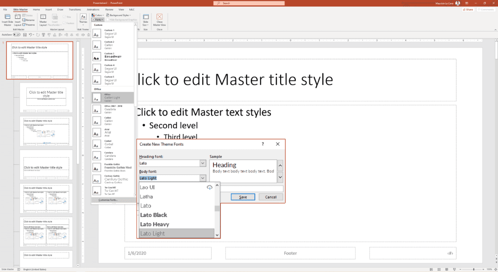
I applied Lato to Heading and Lato Light to the text Bodies.
With this simple modification, the whole presentation will now work on the new set font, the official font of the template.
Have you noticed that you don’t need to change the font slide by slide?
That’s why the slide master can be a faithful companion that saves you a lot of work.
Let’s proceed with the cover design.
In the slide master, you should always change layouts already similar to the one you are looking for, without necessarily having to create a new one.
Next, go to the title layout of Microsoft’s basic template.

I activated the third-party rule directly from the MLC PowerPoint Add-in to create a graphical design grid that guides me in applying the golden ratio to the cover slide.
Do you understand what I said, do you know how to use the thirds rule?
If you don’t know what I’m talking about, I strongly suggest you read Creating an Effective Presentation in PowerPoint with the rule of thirds.
I placed the title and subtitle, resizing them on the two lower PowerPoint.
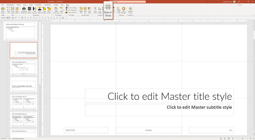
About 2/3 of the upper space could give us the opportunity to insert an image. To stay on topic, I’ll look for a tobacco image in the Graphic Library (MLC Assets).

I resize the image in the proportions that the rule of thirds imposes on me.
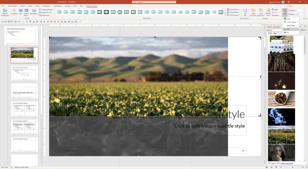
To do so, set the crop frame at the edge of the slide and fill it with the image using the automatic fill contained in the crop menu.

The image is very beautiful, but green is not part of the colors we can use in our presentation.
What do we do?
Simple, let’s desaturate the image and put it in the background to make the title visible.

I apply a color filter of the brand’s main color.
How do you do that?
Follow me.
I place a rectangle above the image and give it the same size as the image using the Make Same Size of MLC PowerPoint Add-in.
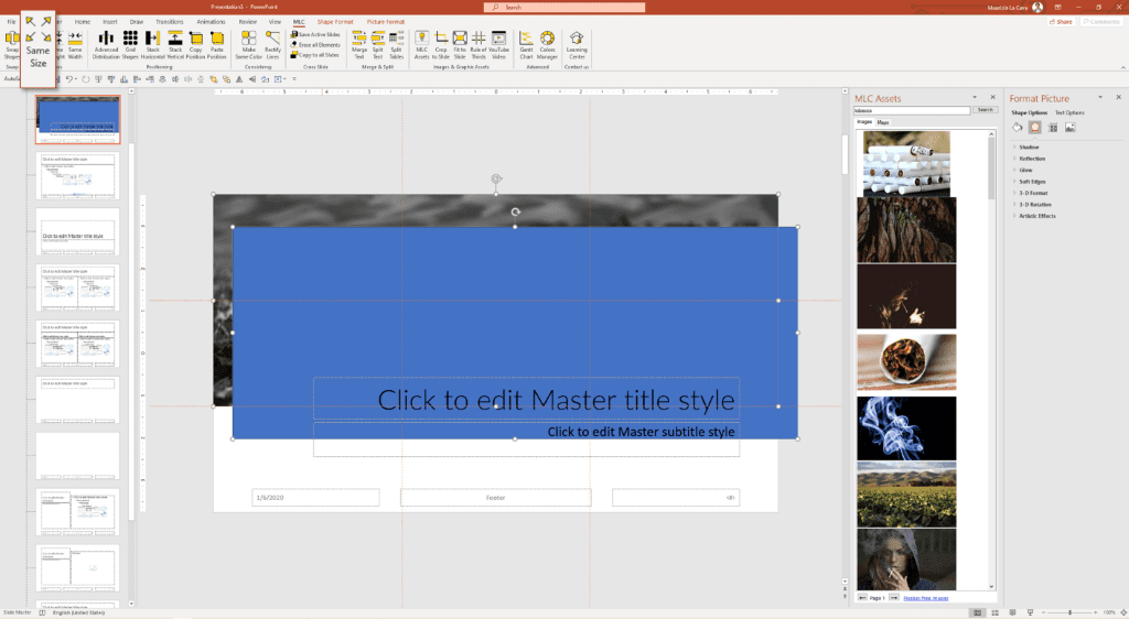
Now, I superimpose the box on the image with the alignment functions that I have set up in my Quick Access Toolbar in PowerPoint.

If you have not yet configured your Quick Access Toolbar, I suggest you do it quickly following the advice number 2 of the guide.
This rectangle, however, is not the corporate blue of PMI, so I have to use a little trick.
First, I put the PowerPoint I’m working on next to the PMI website where I found the official color.
With the eyedropper, I can directly sample the rectangle color from the website.

Crazy, right?
I was able to sample the color outside of PowerPoint.
If you’re curious about how I did it, ask me in the comments and I’ll be happy to explain it to you.
But you can’t see the image anymore!
The most common technique is to give transparency around the box. In this case, I’ll apply 40% transparency to make the image behind visible and not fade the corporate blue too much.

Here is the filter on the image!
The title, however, is not readable, so we must also use a filler for the title placeholder.
Let’s apply the corporate blue to the texts too, and make sure that the title is in Lato and the subtitle in Lato light.

We’re almost there.
We adjust the page number, footer and date fields so that they are consistent with the corporate template we are developing.
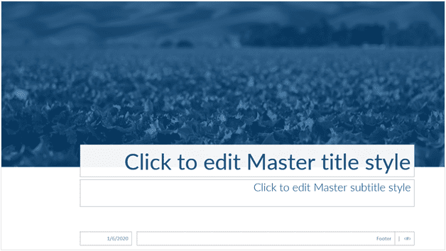
All that’s left is to apply the logo, and we’re done!
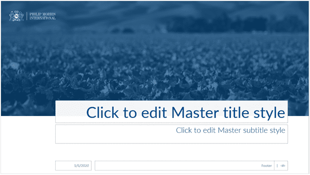
Here’s an example of a cover.
Let’s try it now.
Exit the slide master and return to presentation mode.
Simply select the layout from those available and apply it to the active slide.

The layout is ready to be used.
To activate the footer fields just enter the footer management menu from the insert tab.

Here is the new cover for the PMI corporate template.
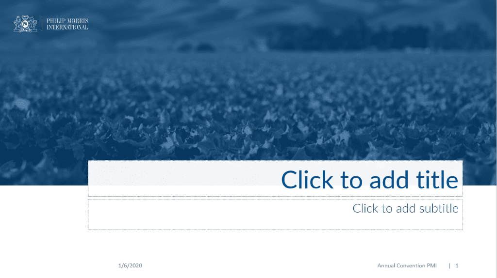
Do you like it?
From now on, every time you need to create a presentation, just bring out the layout and write the title and subtitle.
Do you realize how much time is saved and how communication becomes consistent thanks to the use of a corporate template?
Conclusions
Creating a PowerPoint corporate template is complex and articulated work, but the payback is enormous in terms of increased productivity and consistency in communication.
To create a corporate template, you need to be able to develop layouts within the PowerPoint slide master.
Once all the layouts are set, it will be very easy for the user to call them up and use them in the best possible way.
I could have made other examples of layouts – if you are interested ask me in the comments, and I will be happy to integrate the article.
Comments on How to create a Corporate PowerPoint Template