

We all faced the dreaded issue of presenting tables in PowerPoint as a full load of data, often coming from Microsoft Excel. Especially if you work in business, you will always need to present performance updates, data analysis, market analysis, stock analysis, trends, etc.
How do you make cool PowerPoint tables to represent all of that?
Today, we live a world made of numbers, the more we can quantify better and safer decisions. Therefore, we tend to use data as much as we can to take more effective decisions every day.
However, we often misrepresent our message presenting data on its own, so we end up presenting long lists of figures, missing the real message behind them.
It is correct to spend time doing your analysis and coming up with results that will support your decision, but when it comes to presenting the result, you need to focus in order to communicate effectively. After a long time spent doing your analysis, you might feel like you deserve to tell other people about your work, and you’ll risk alienating your audience to do so during your speech.

You need to remember that you did the work so that you could make the decision, and not to tell the others how well you have been in doing it. What you want them to know is:
- What’s the final decision?
- Why you decided to take it?
Therefore, you might need to show some of the results, but you don’t need to present the entire process of coming up with them. They might as well go through the data themselves if that’s what you decide to do.
Presenting data is always a matter of personal choice. The first thing you need to create best PowerPoint tables and to ask yourself when copy-pasting a table into a slide is:
“Do I really need to show all the data to communicate my message?”
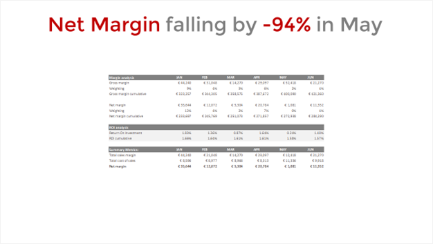
It might happen that you do not need the full data table to inform your audience. If you are a controller and you want to tell the management that in May, the Net Margin fell by 95% against April’s profits, you might not need the full P&L, as they know you can do your job, which is to alert them if needed. They do not need to be involved in your job as much as you are.
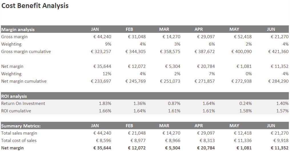
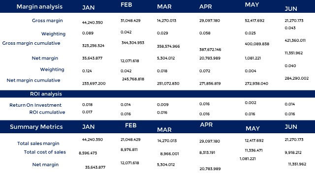
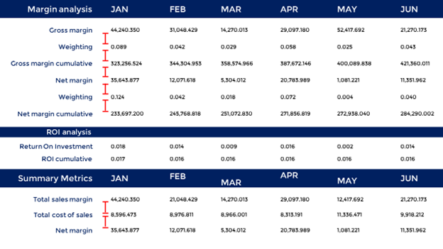
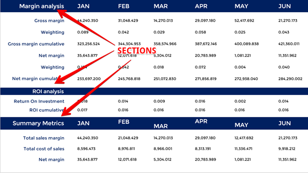
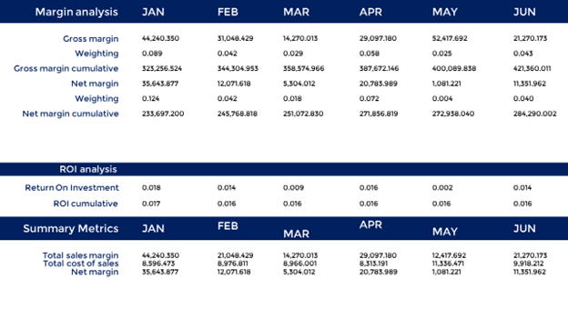
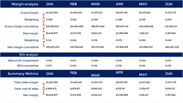
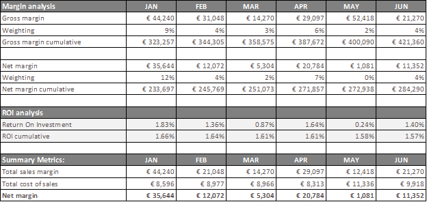
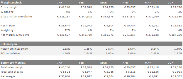
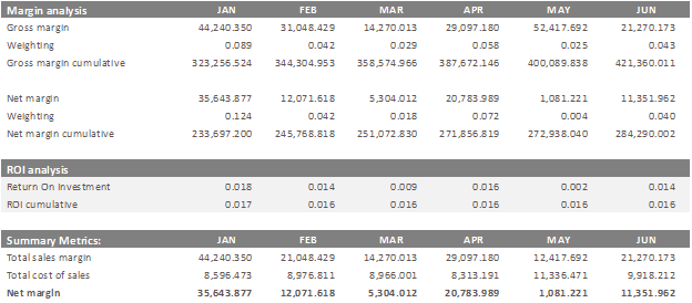
NB. All figures in the table below are fake and not necessarily correlated. Figures are for illustration intent only.
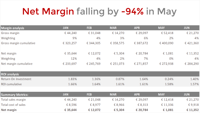
So, instead of presenting the full table, you might just go for a very simple chart. This is en effective tip to create best PowerPoint tables.
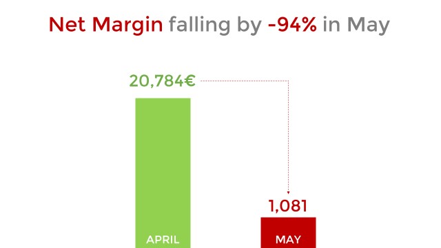
You could, of course, show the Net Margin figure for all the months and then just highlight the one concerned, but I wanted to show you how much you can be synthetic and earn in communication effectiveness.
I understand that tables are often used to trigger a discussion and let the audience make observations about the figures.
In these cases, you are not just communicating the highlights, and you are forced to show the whole amount of data.
The first thing to avoid doing is copy-paste from Excel and leaving it as it is!
Remember, your objective is designing good looking tables in PowerPoint that can be read easily and quickly. The faster your audience can read your cool PowerPoint tables, the better it is.
Remember these two words: ease and speed!
There are ways to accomplish this by manipulating contrast, alignment, spacing and ordering. All these elements help to achieve clarity so that the reader can pick out specific data and understand the discussion of your results.
Getting rid of the clutter is the first step, working out contrasts is the second step and finally you’ll be working to create a story that engages the audiences and take them through your analysis (if you like this topic you’ll love The definitive guide to presenting data in PowerPoint)
Transform tables into shapes
The most powerful way to create cool PowerPoint tables is turning them in shapes.
If you do so, you will be much more flexible in managing each and every cell as an independent textbox. Therefore, you will be able to align textboxes, to edit them, to change the font size and the font color of a single textbox without influencing the whole table.
Transforming a table into separated text boxes might be a nightmare if you do not know the following powerful hack from my colleague T. Croonquist.
Applying the same technique on our table example, you can quickly split it into shapes.

With shapes, you are finally free to play around and to make your slide beautiful, turning an awful table in the best PowerPoint tables:

You will need experience to be quick at turning good looking tables in PowerPoint into shapes. You might have a standard format internally approved that you cannot radically change.
Therefore, from now on, I’ll show you part of the following techniques applied to the reshaped table and part of them applied to the old style table so you’ll know that you can apply them in both cases. Keep in mind that the best practice is always to turn the table into shapes and work from there.
Highlight core messages with contrast
By making key elements of your table stand out from one another, you can group or distinguish data from each other.
For example, you could bold the title, dividers, or headings. You can use different font sizes, styles, or letter cases for different elements in your table.
You can use color to emphasize backgrounds or text. Regardless of which of these you choose for creating contrast, remember that “less is more” when it comes to creating an effective table.
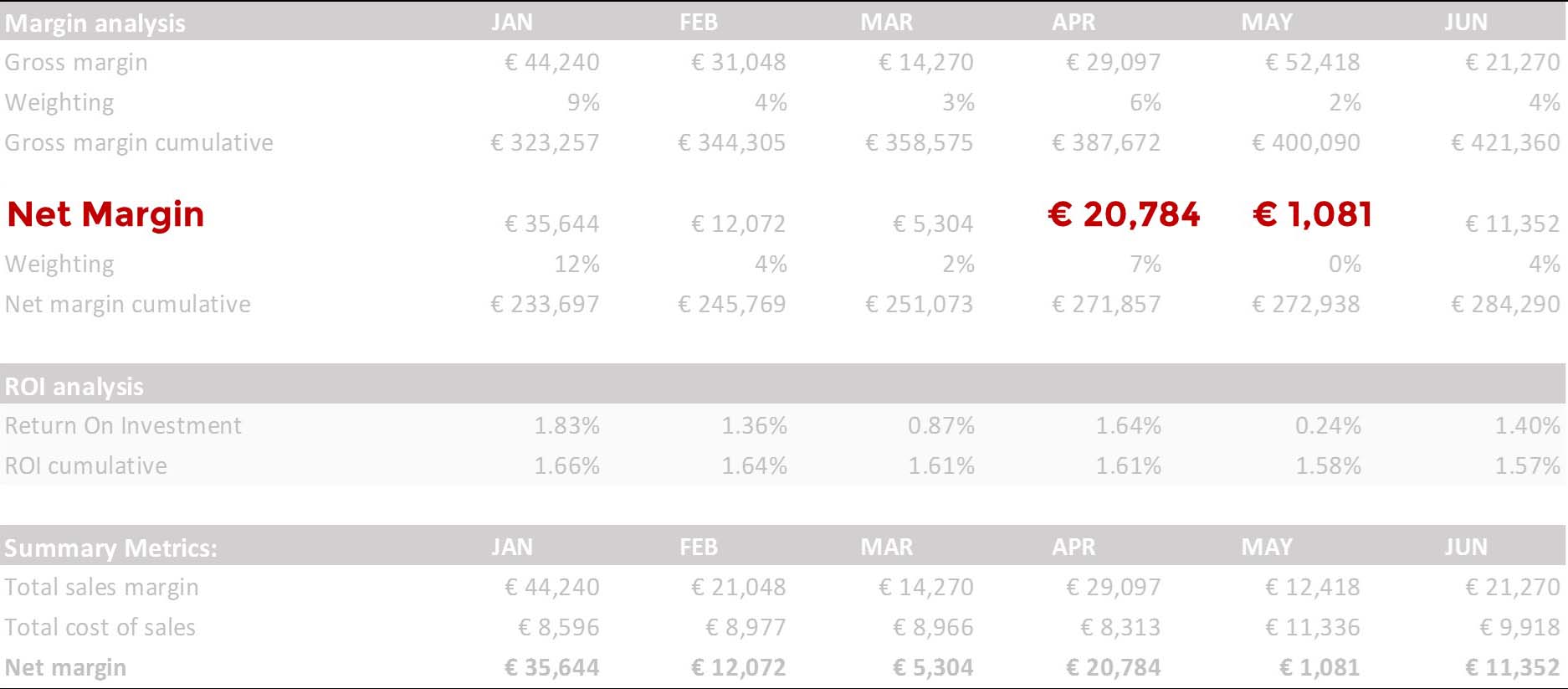
How to get this result?
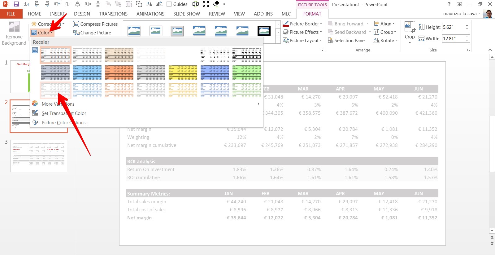
Copy-pasted the table into PowerPoint as an image.
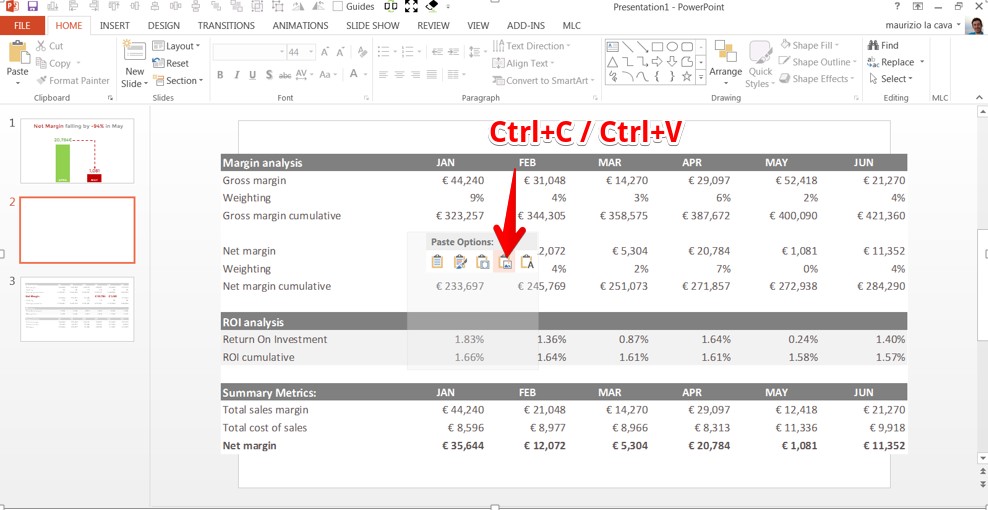
Resize and desaturate the image.
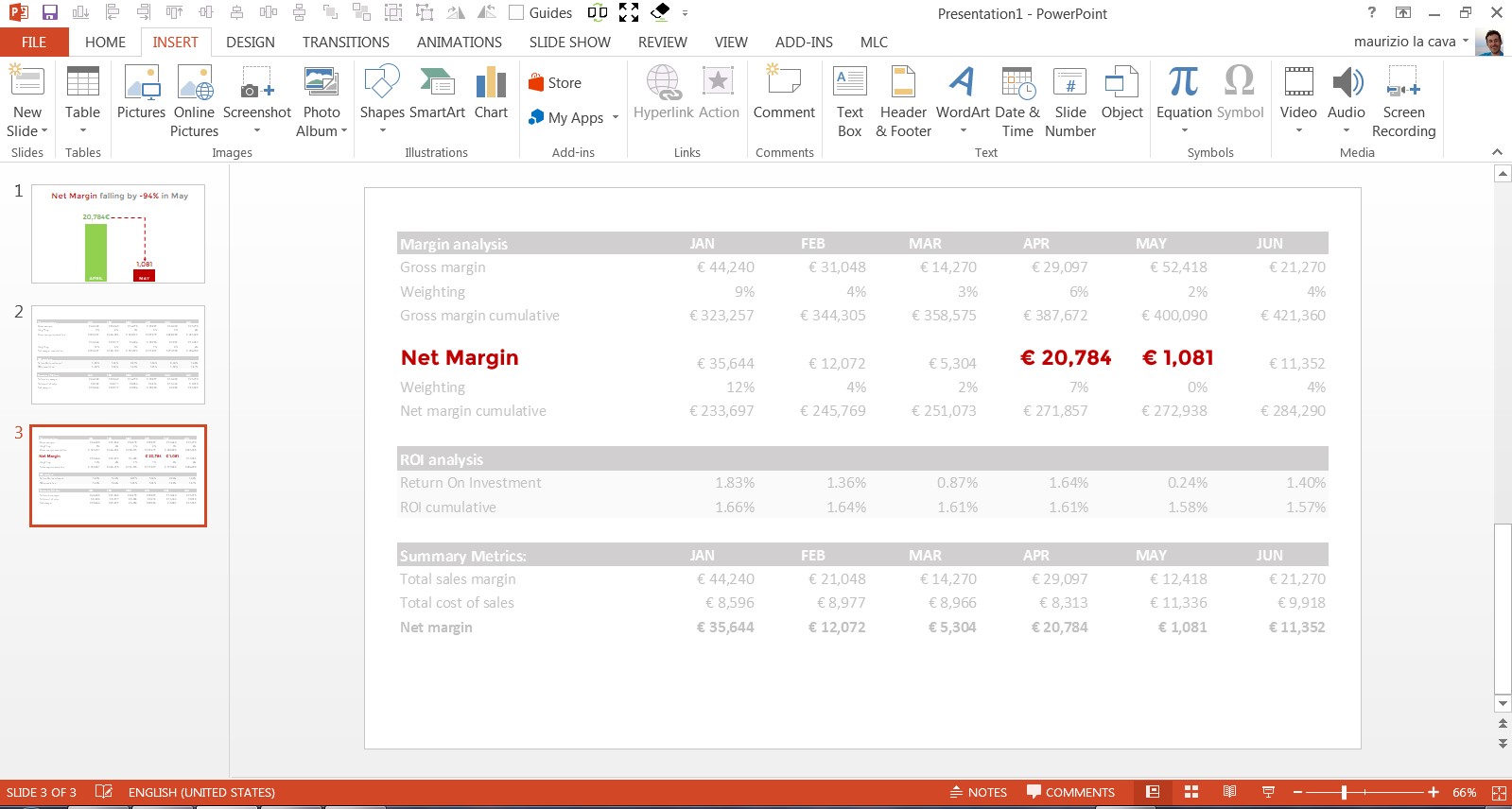
Another step to create good looking tables in PowerPoint is to add 3 text boxes with white background over the old figures.
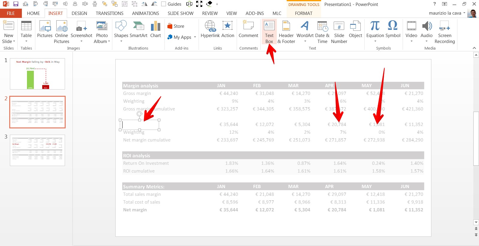
Choose a different font, increase the size of it and change the color.
Aligning and grouping figures in the table
Alignment is important for keeping your table neat and clear. For example, all numbers in the columns should line up with each other and with their headings. Structure your table so that all elements seem to be properly aligned with each other: titles, headings, data, dividers, notes.
When you work with shapes, resizing and distributing them, you’ll end up with a messy look and feel because shapes won’t be aligned.
This is when you need to start using the PowerPoint alignment functions.

In this case, you would need a mix of alignment and distribution functions. Let me show how I would do it:
Align months column text to the left and the first column text to the right.
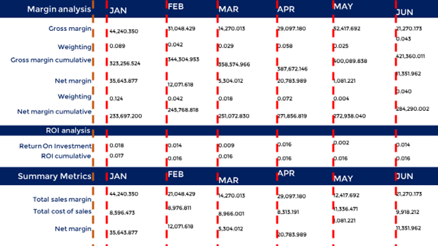
Align text horizontally.
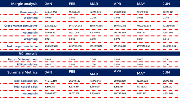
Now you need to distribute the rows within each section (i.e. Margin analysis, ROI analysis, Summary metrics). First, you need to group the rows (shortcut CTRL+G on selections). To quickly ungroup items, the shortcut would be CTRL+SHIFT+G.
Once grouped, you can distribute the rows vertically to proportion the white spaces among the items.
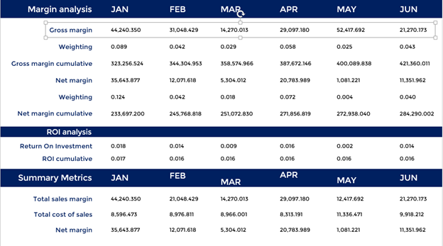
Ordering and segmenting items in the table
Group similar items in order to give a sense of structure and meaning to your table. This will also help break up the data, making it easier on the eye.
Another way to order data is to indent subordinate data when it falls below specific column data. This is not required if you are working with a standard format of figures (eg. P&L, etc.).
In the example below, I decided to split clearly the 3 different sections: Margin analysis, ROI analysis, and Summary metrics in order to give an orientation to the reader, who understand at a glance what is looking at.
Do not forget this important tip to create cool PowerPoint tables.
Spacing and white spaces for cool PowerPoint tables
Manipulating the “white areas” around the figures can also help clarify and organize the table.
For example, you should always have enough space around and between texts so that it stands out. You can use space to separate groups or emphasize them. When working with shapes, this is much easier to obtain than working with tables.
In the previous example, I took advantage of all the space available and distributed the text boxes in order to create proportionate white spaces between them.
The first picture below shows how it might look if the text boxes were all glued together.
The second picture, from the previous example, shows how much clearer the slide is leveraging all the white space available.
Following all these tricks for cool PowerPoint tables, you’ll see that creating good looking tables in PowerPoint will be easier.
Killing table lines
You have many options to add lines to split cells in the table. It is a common belief that if you split numbers with lines, they will become more readable.
Remember what I said about white spaces?
The same applies to the gridlines. Try to keep your table as clean as possible and your slide’s readability will benefit from it. Check the example below.
With gridlines:
Without gridlines:
The second table without the gridlines is much cleaner and more readable.
Use the full slide
Slides are like a bigger piece of paper and they are digital so do not worry about wasting them, just leverage the full space they provide you!
Whether you are using the slide to show a table or other contents, use the entire space you get. This allows you to use bigger fonts and larger spaces among the figures.
I’d recommend to use the same technique to get rid of the clutter of charts as well, check the definitive guide on how to Presenting data in PowerPoint.
Rounding the numbers for a better readability
Another trick to create good looking tables in PowerPoint is helping your audience by rounding the values presented in your tables.
Rounding can also be used when the data does not have a high degree of accuracy.
In some cases, only rounded data is reliable and should be displayed in tables. Take care not to lose too much information when rounding your data.

In the example above, the rounded numbers on the left are easier to understand and memorize than the exact numbers on the right. The use of a space as a thousand separator is also illustrated in this example.
If you need to display values with varying numbers of decimal places, you should align them on the decimal point, not on the right.
In the example below, the values on the left are easier to read than those on the right. This example also shows that it is much better to display the same number of decimal places in all values.

Numeric values should be right justified. Using the same example, notice how difficult it is to read the values when the numbers are justified to the left margin as shown below.

Manage complex and cool PowerPoint tables
Tables aren’t always just grids of text. In creating presentations, you will face the issue of formatting complex tables made with both text and images.
In these situations, your experience with alignment functions won’t be enough, and you’ll risk wasting a lot of time.

The slide above is the summary of my presentation design training. It is simple and effective, and it clearly replaces the traditional bullet points.
As you can see, text and images are perfectly aligned but I did not place every image/text box one by one. If it got to be more than just 6 images, it could take forever!
So how did I do it?
First you need to source the icons and to get them in your slide.

You need to resize them, as they they will most likely be of different sizes.
I do not apply the sizes one by one, instead using the “Make Same Size” PowerPoint custom function that I developed within MLC PowerPoint custom Addin.
I resize the first shape manually choosing height and width.

Then I add the other items to the selection.
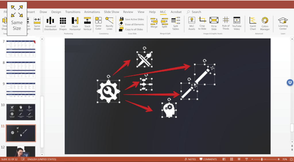
And finally, I apply the same sizes to the all the shapes in just one click.
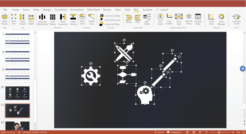
If I need to resize them altogether, I can now use the shortcut CTRL+UP/DOWN ARROW on my keyboard to change their dimensions.
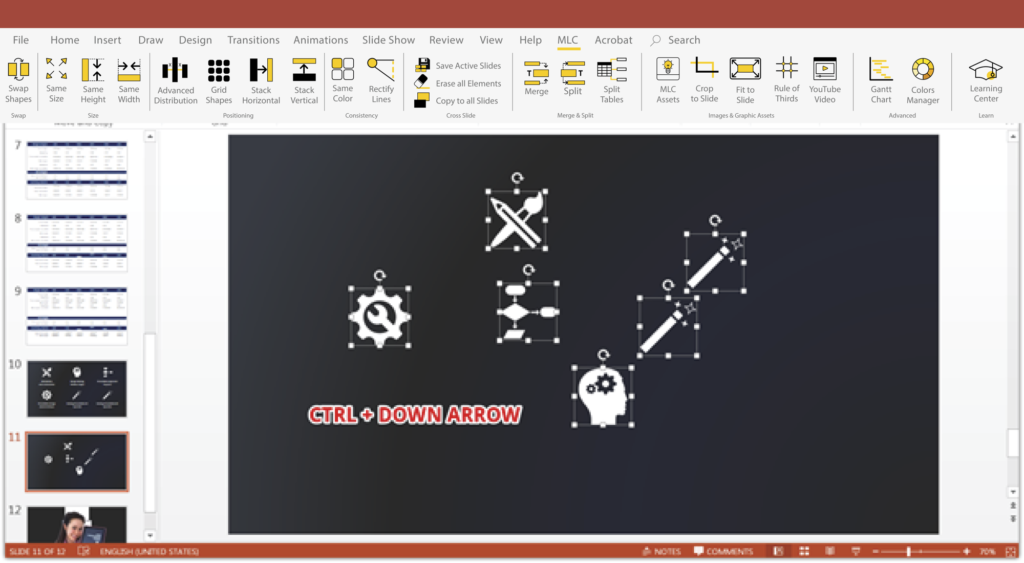
Now it’s time to distribute them in a table format. Select the “Align Shapes” function, and fill in the number of rows/columns that you want your images arranged in.
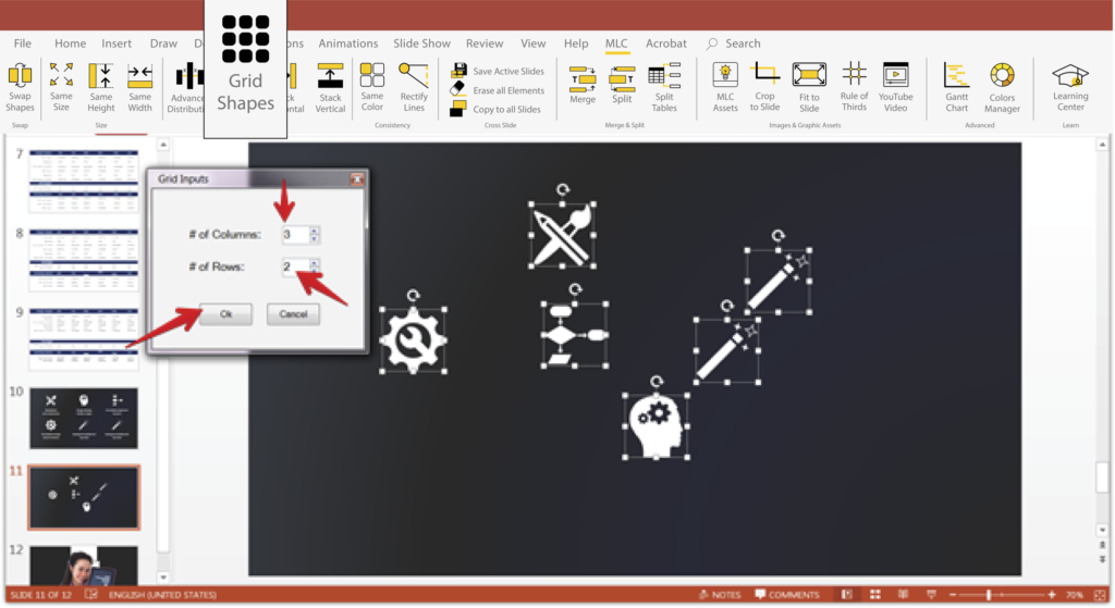
Thus, you create a grid of perfectly distributed and evenly-sized shapes.

Now I want them to take more space on the slide horizontally, so I group them and then use the Advanced distribution function.
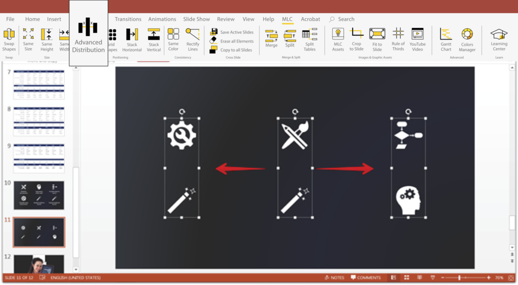
Then group altogether, and Align Objects in the middle of the slide.

The shapes are aligned and perfectly distributed, but they are not all in their positions.
In order to move them but still keep the work done so far, you can use the magic “Swap Positions” function.

The final step for cool PowerPoint tables is to add the text and align it with the shapes. The great thing is that you already know exactly where to place the text box. Fill in the text boxes with the same text.
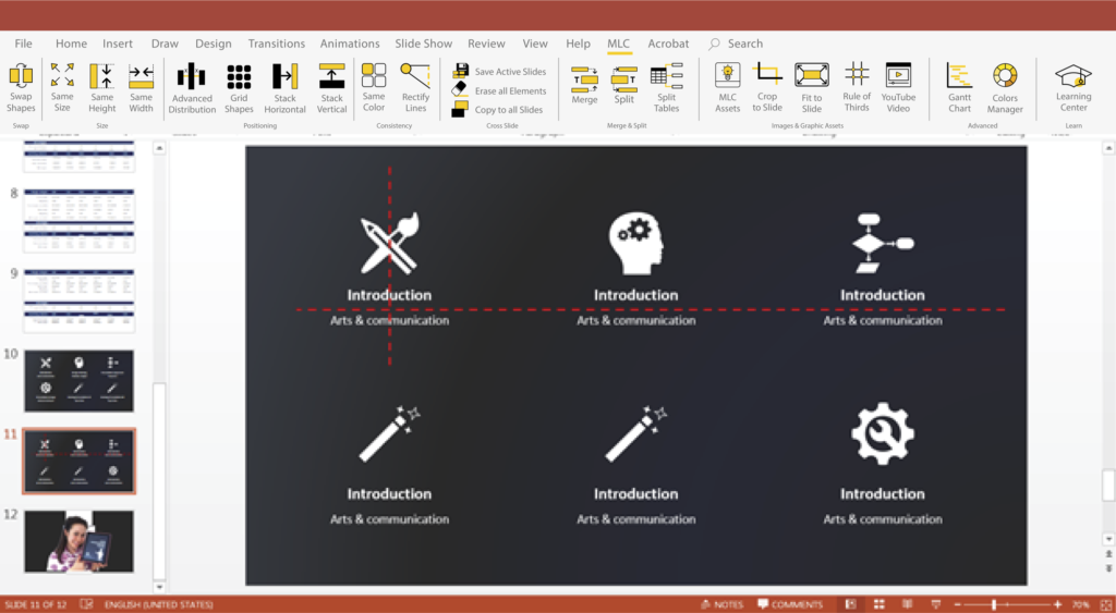
Then write the text within each of the already-aligned and distributed text boxes.

Click here to download the MLC PowerPoint custom Addin for free and start boosting your PowerPoint effectiveness!
Conclusion
If you work with cool PowerPoint tables and you know they have a deadly effect on your communication and your audience.
You should be aware of several hacks and easy-to-use techniques that could turn boring tables into effective communications (learn more about how to effectively Presenting Data in PowerPoint on my new guide).
Remember, you do not have to show that you are good at what you do, but you need to leverage the results collected after the long analysis process, in order to share the results and to support your decisions in front of your audience.
It’s not about making cool PowerPoint tables; it’s about making your slide communicate.
I know is not easy to create cool PowerPoint tables, it is a hard topic, so please do not hesitate to share your comments to this article. If you like it, I’d really appreciate that you share it.
Key Takeaways
Clarity Over Quantity: When presenting data in PowerPoint, prioritize clarity by focusing on the key takeaways rather than overwhelming your audience with full data tables. Show only the data necessary to support your message.
Transform Tables into Shapes: Convert tables into shapes for greater flexibility in design. This allows you to independently manage and style each cell, making the table more visually appealing and easier to read.
Use Contrast to Highlight Key Information: Employ contrast through font styles, sizes, and colors to draw attention to the most important elements of your table. However, keep it simple—too much contrast can be distracting.
Alignment and Grouping for Neatness: Proper alignment of text and numbers in tables is crucial for maintaining a neat and professional appearance. Group related items to create a structured, easy-to-follow layout.
Leverage White Space: Utilize white space effectively to enhance readability. Avoid clutter by ensuring that text and figures have enough space around them, making the table more digestible.
Minimize Use of Gridlines: Reducing or eliminating gridlines can make your table appear cleaner and more readable. Focus on using white space and alignment to separate data instead.
Rounding Numbers for Simplicity: Round numbers where possible to make data easier to understand at a glance. Consistency in decimal places across the table further enhances readability.
Optimize Slide Space: Make full use of the slide’s space by resizing and distributing elements appropriately. This not only enhances visibility but also ensures that your table is easy to read even from a distance.
Efficiently Manage Complex Tables: When dealing with complex tables involving text and images, use alignment and distribution tools to save time and ensure consistency. Group and align elements to maintain a clean and organized slide.
Purpose Over Process: Remember, your goal is to communicate the results and support your decision-making, not to showcase the entire analysis process. Focus on what the audience needs to know to understand your decision.
FAQs
How do I make cool PowerPoint tables to represent data?
To create cool PowerPoint tables, focus on communicating your message effectively rather than displaying all the data. Use contrast, alignment, spacing, and ordering to make tables clear and visually appealing.
Should I present all the data in my PowerPoint tables?
Not necessarily. Only show the data that is relevant to your message. Avoid overwhelming your audience with too much information; instead, highlight the key figures that support your decision.
What is a good way to emphasize key data in a PowerPoint table?
Emphasize key data by using contrast—such as bolding titles, using different font sizes, or adding color. This helps group or distinguish data elements, making the table more readable.
How can I ensure my PowerPoint tables are easy to read?
Ensure ease of reading by aligning text and numbers properly, spacing elements evenly, and using white space effectively. Avoid clutter and unnecessary gridlines to maintain clarity.
Is it better to turn tables into shapes in PowerPoint?
Yes, transforming tables into shapes can give you more flexibility to manage each cell as an independent textbox, allowing for better alignment, text formatting, and overall design of the table.
DON’T HAVE TIME TO READ THE ARTICLE? DON’T WORRY, LET ME SEND YOU A COPY
Comments on How to create cool PowerPoint tables
Bernard Vukas
Hi Maurizio,
Awesome post — I learned something new today. Thanks for sharing, and I look forward to reading more in the future.
Best,
Bernard
Maurizio La Cava
Hi Bernard, thanks for your comment. I’m glad you appreciated my contents.
David Wollenberg
The table to shapes trick is fantastic – had no idea it was possible. Thanks for sharing.
Maurizio La Cava
Hi David, I find it very powerful when I need to rework tables. It will surely speed you up! 😉